Time
- 2017 – 2020
Role
- UX Design
- UI Design
- Frontend Development
When I joined data analytics startup Qlaym in 2017 as their first designer, my main assignment was to (re)design Qoactive®, the startup's cloud based machine learning application.
I developed a UX/UI concept and designed a white-label interface for Qoactive® which later was transformed into a design system. This was done in two major progressive steps.
Additionally I developed UX concepts for new data analytics modules and functionalities and improved them in an iterative process.
My work included taking an active part in agile frontend development, leading responsive, component-based HTML/CSS template development and the implementation of the design system in the workflow and React application.
This case study may contain sensitive information. You are kindly asked for discretion.
UX/UI status quo Initial Situation
Before I joined, Qoactive®'s interface was developed based on the Bootstrap framework by the frontend team. Since it grew organically with new functionalities, it basically consisted of a cluster of buttons, interactive diagrams and data tables.
It offered little to make the advanced machine learning methods it made available comprehensive and usable. It was hard to understand and had no recognizable workflows.
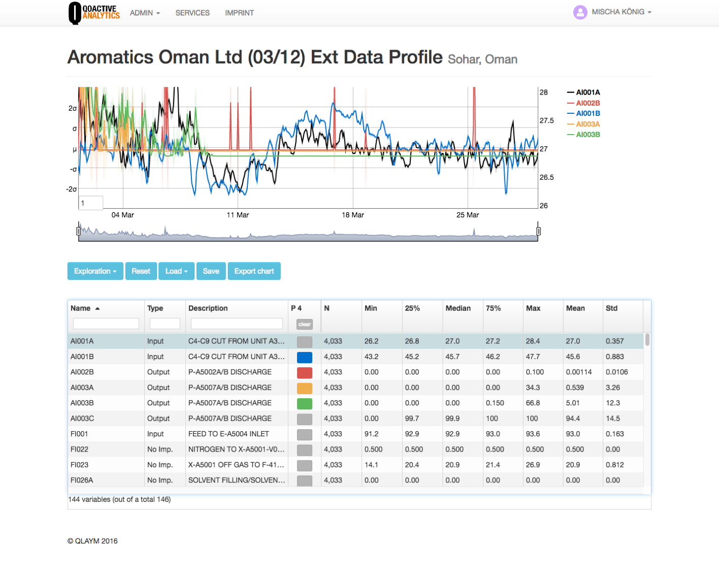
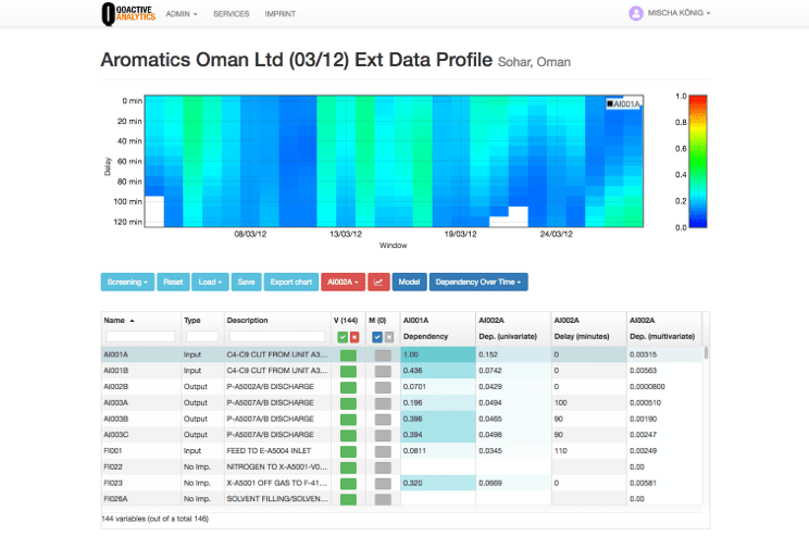
The interface design was driven by the Bootstrap framework. Information architecture, navigation and labelling were hard to understand without explicit knowledge.
Restructuring Improving Information Architecture
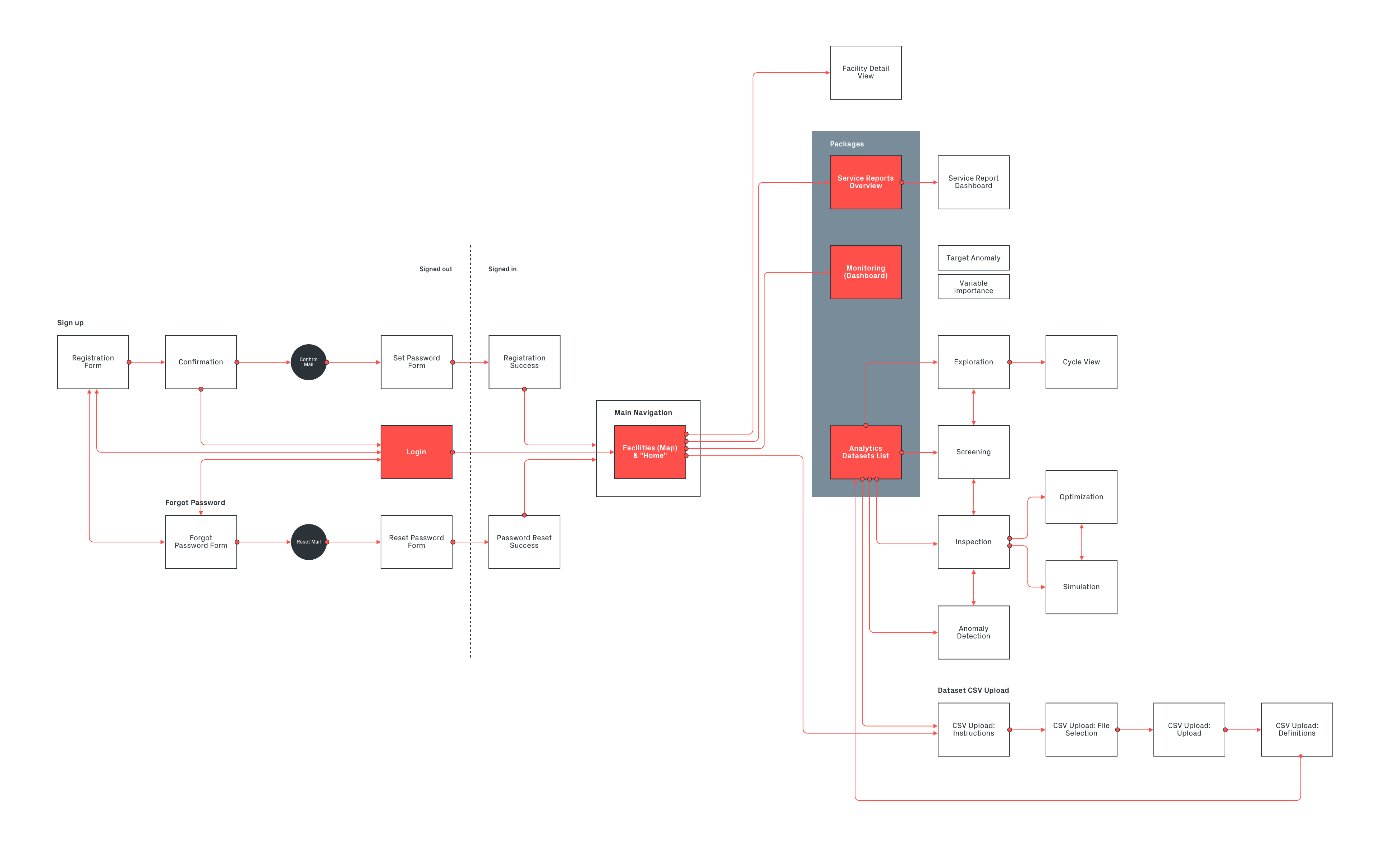
After an assessment of all components of the application, I created a concept for unifying and and improving their structure and created consistent interaction models so that users had less to learn on each module.
Most importantly, the navigation had to be structured to match the mental model of the users and the intended user journey. This meant replacing a row of buttons with a clearly structured hierarchical navigation and adding clear signpost labels and copy.
Redesigning modules
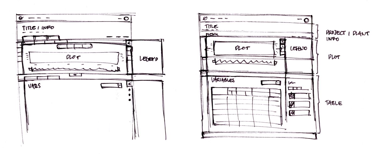
The redesign was done in an iterative process by redesigning and building prototypes of modules one by one based on previous planning and sketches. Prototypes were then discussed in Design Critique sessions within the team.
In these sessions we checked the intended use, data visualisations and functionalities. This also allowed us to improve the interaction model and a lot of the workflows, clean up the interface and generate new ideas.
Testing & Developer Handoff Prototyping
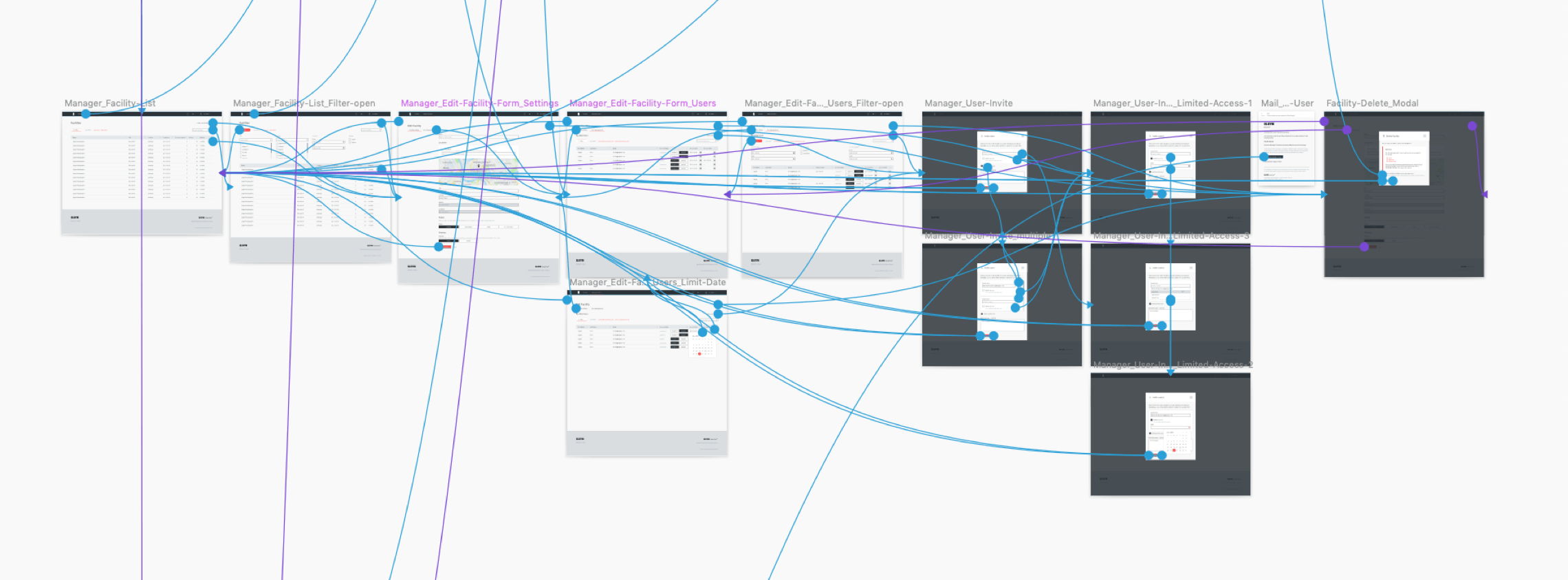
The whole application was prototyped en detail using InVision.
The prototypes were used to present and test workflows and were especially essential for developer handoff. Development was greatly sped up with the possibility to inspect the designs and experience the interactions before building them.
Version 1 User Interface Design
Visually the first redesign was focussing on improving the information architecture, implementing Qlaym's corporate identity and a clear consistent visual language.
Another spotlight was on improved screen use for the main components of the application – data tables and visualizations – and adaptive behaviour down to tablets in portrait mode.
This first version redesign and implementation was achieved in roundabout six months.
Improvement Version 2
In mid 2018 the decision was made to switch the JS framework of Qoactive® from Angular to React. Since this meant rebuilding basic parts of the application, including templates, I decided to use the opportunity and slightly redesign the interface once more to integrate the insights we gained in the previous version.
The new design should take advantage of and pay attention to these circumstances:
- A new corporate identity should be represented in the interface
- Environment and devices for the usage of the application got more clear and the interface could be improved accordingly
- Taking advantage of new web technologies and browser capabilities
- Advancing the implementation of a design system
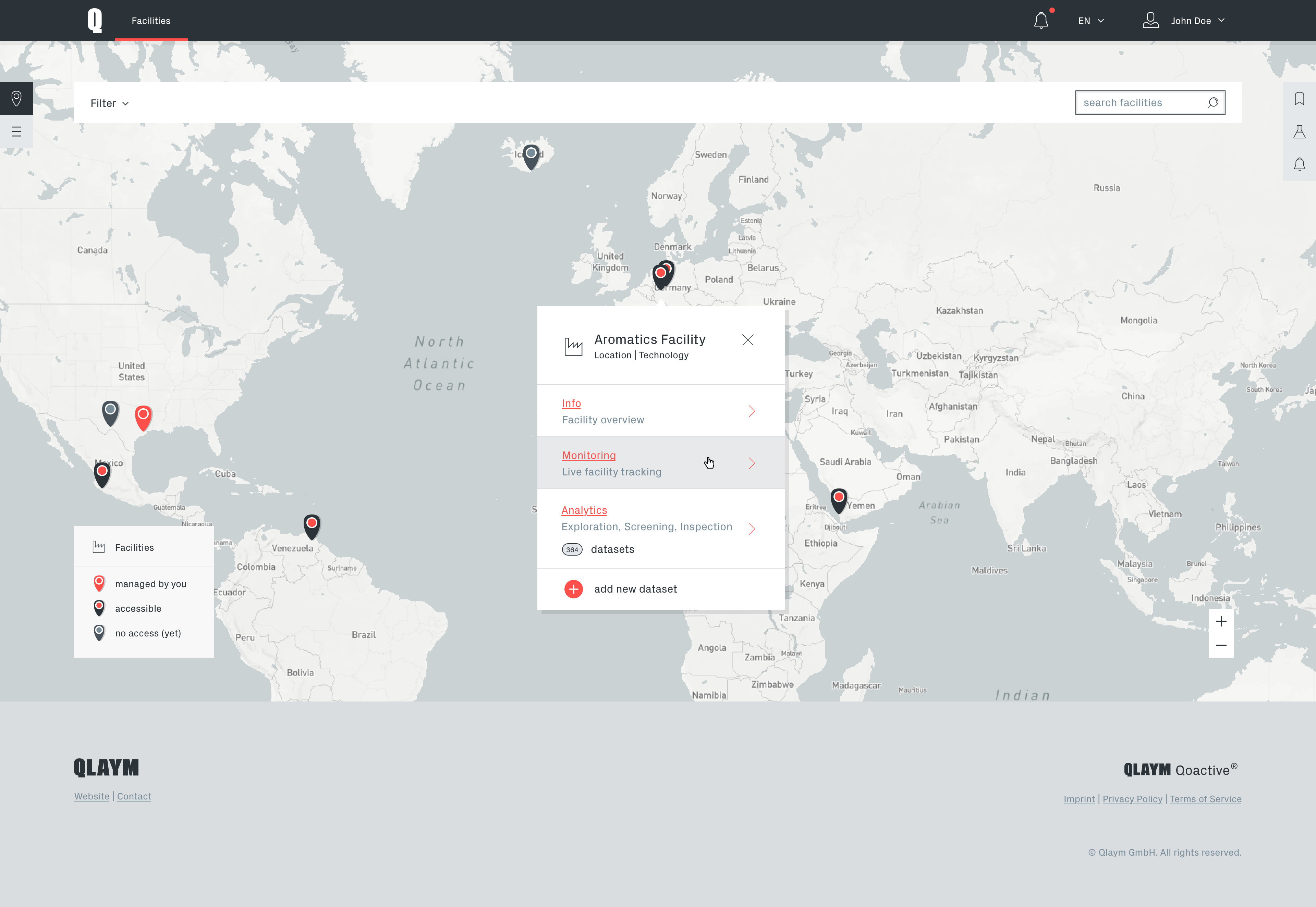
As Qoactive® was a desktop focussed application with a high information density, special attention was given to an even more adaptive approach in the new design to benefit from high resolution screens.
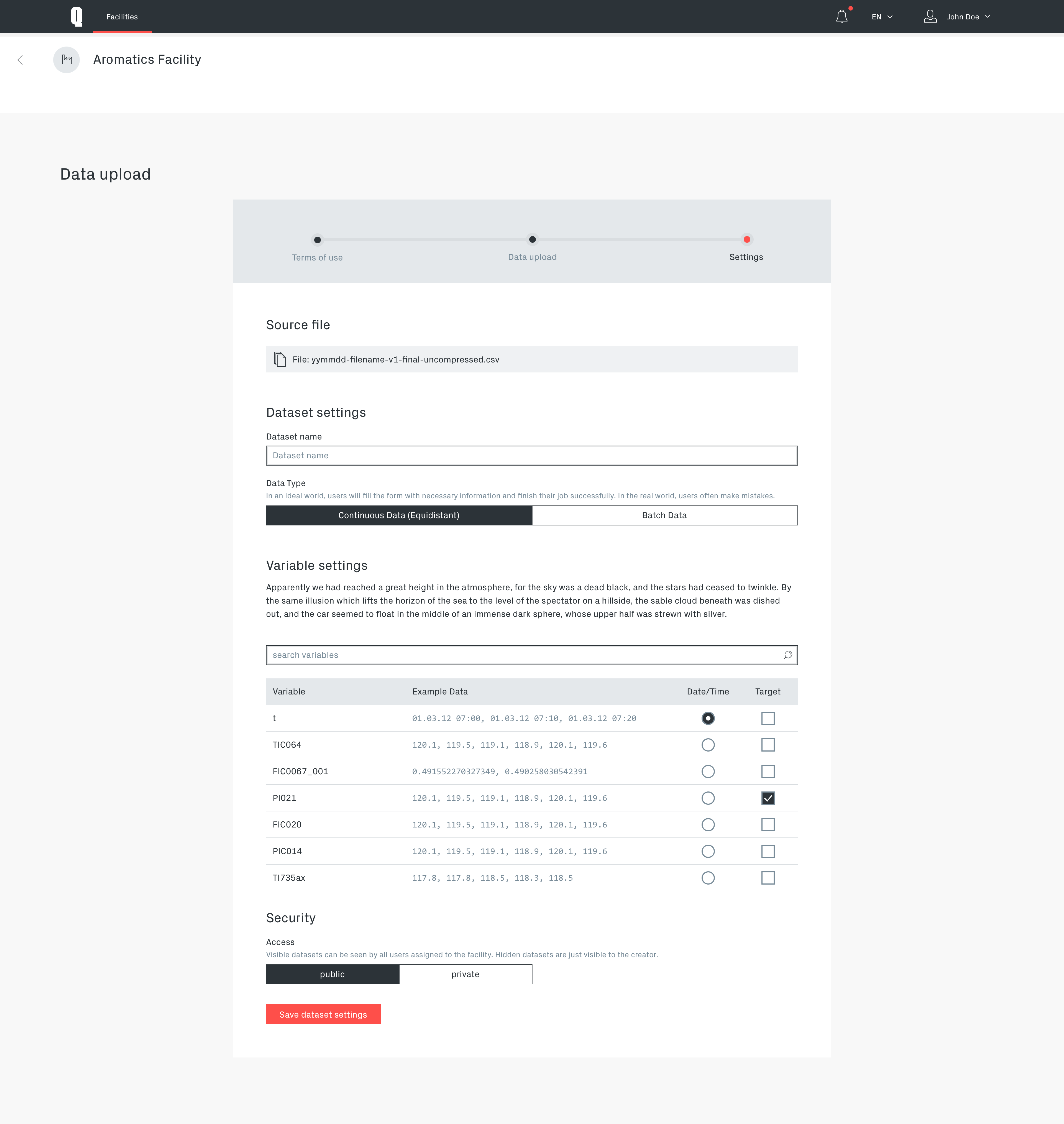
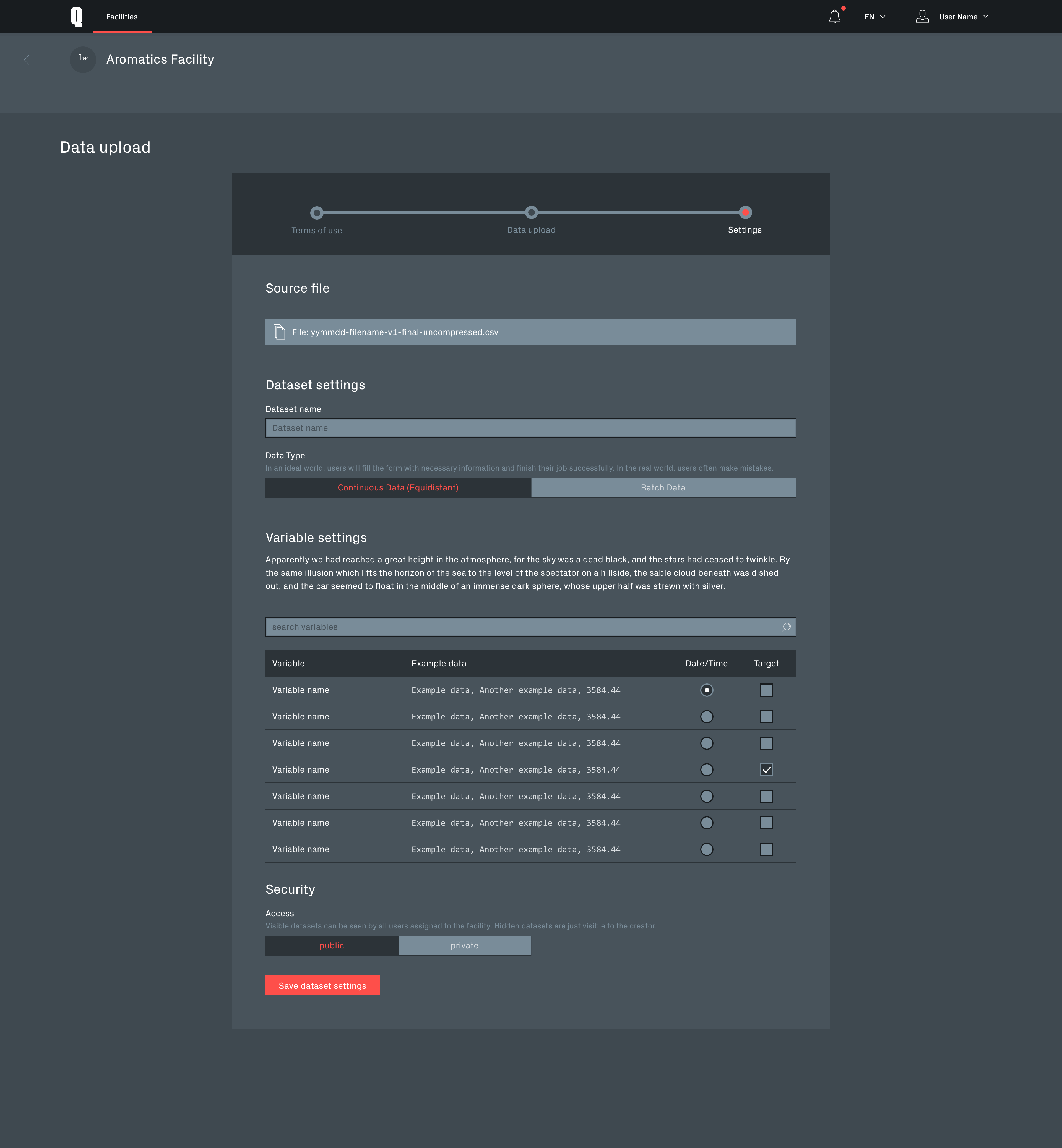
Data upload process
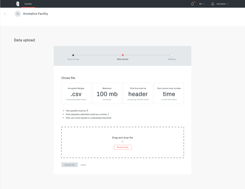
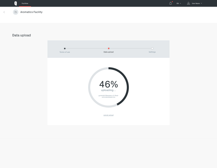
The data upload and recognition process is a crucial part of the application and required particular thorough design.
It is clarifying legal requirements and supporting the user in preparing the data, uploading it and choosing the right settings in order for the system to interpret the data correctly and apply machine learning methods to it.
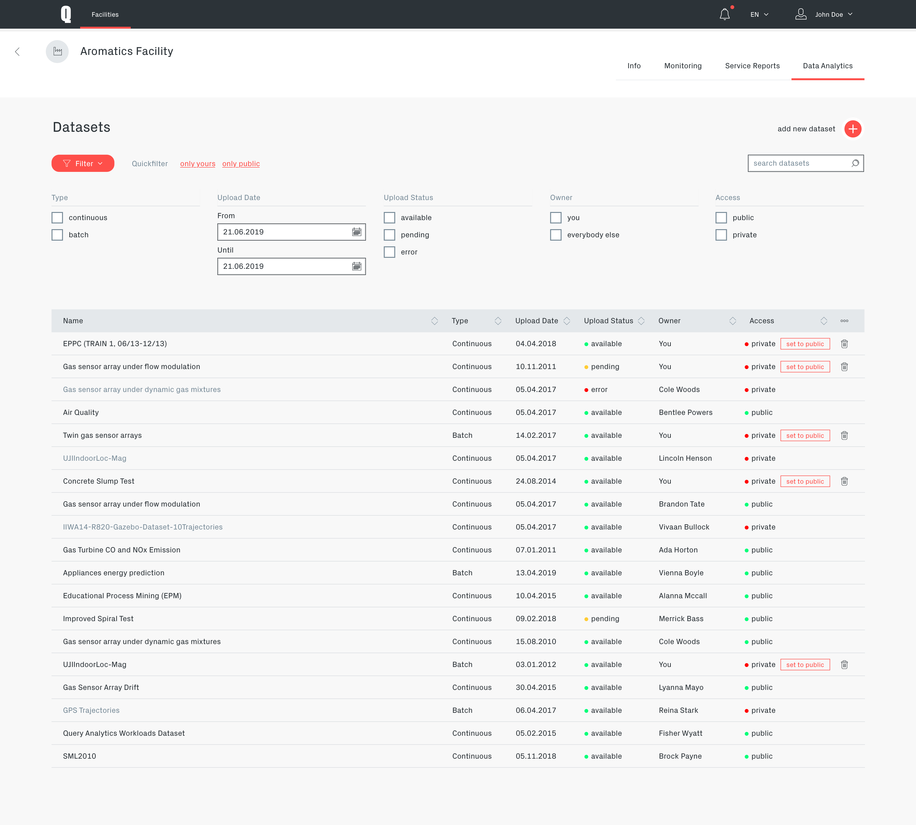
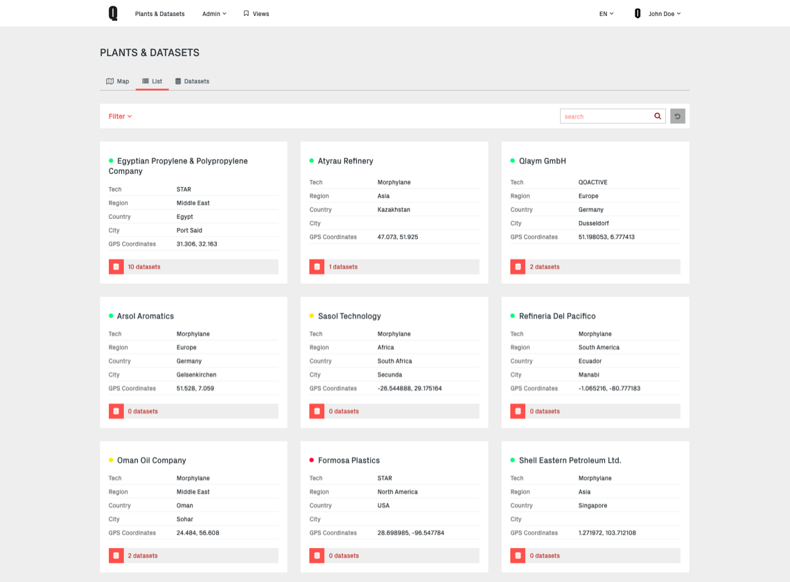
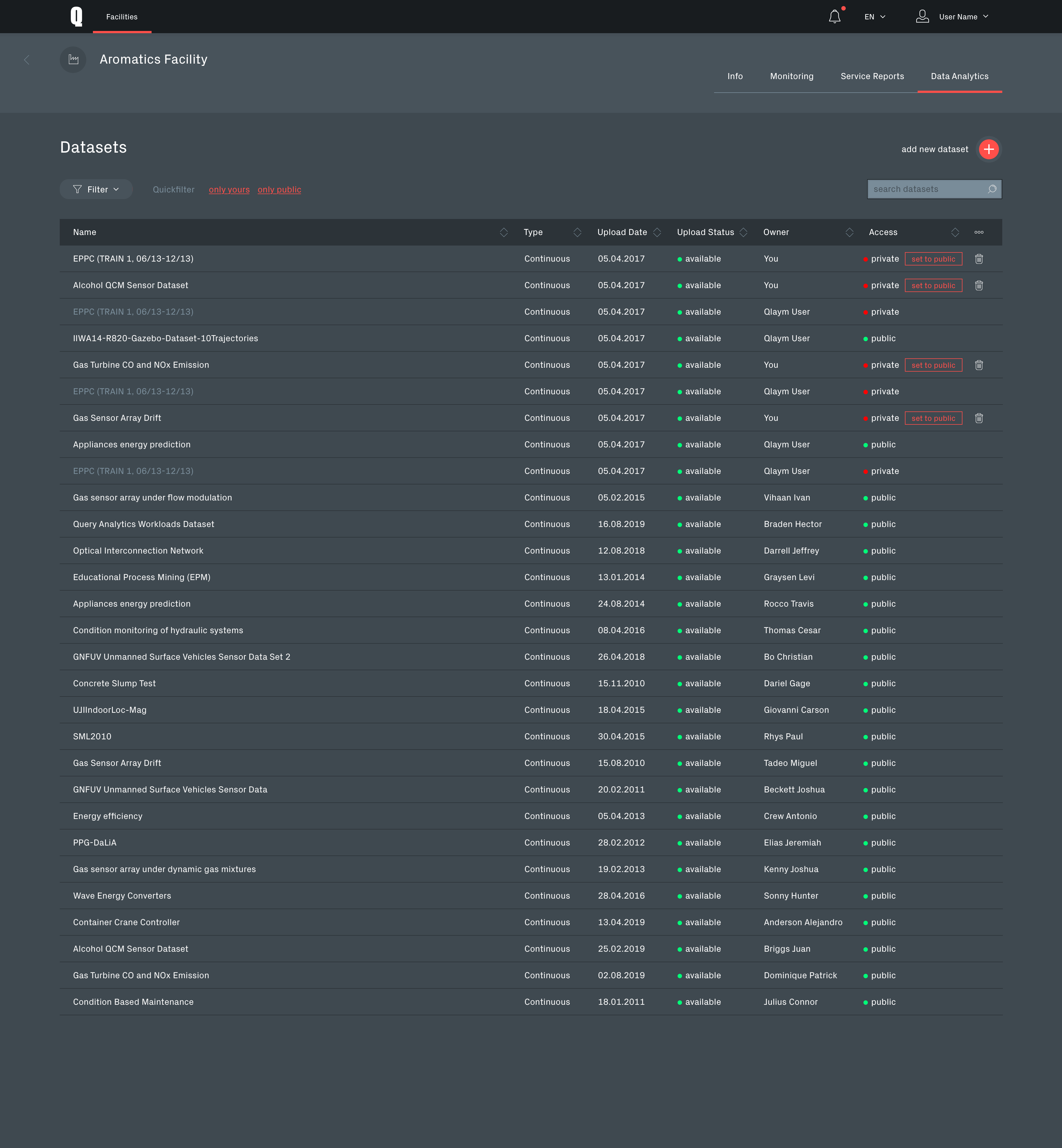
Dataset list
Qoactive® had an rights management system for collaborative work with datasets built in. The "Access" column in the dataset list is offering quick access to the corresponding sharing functionality.
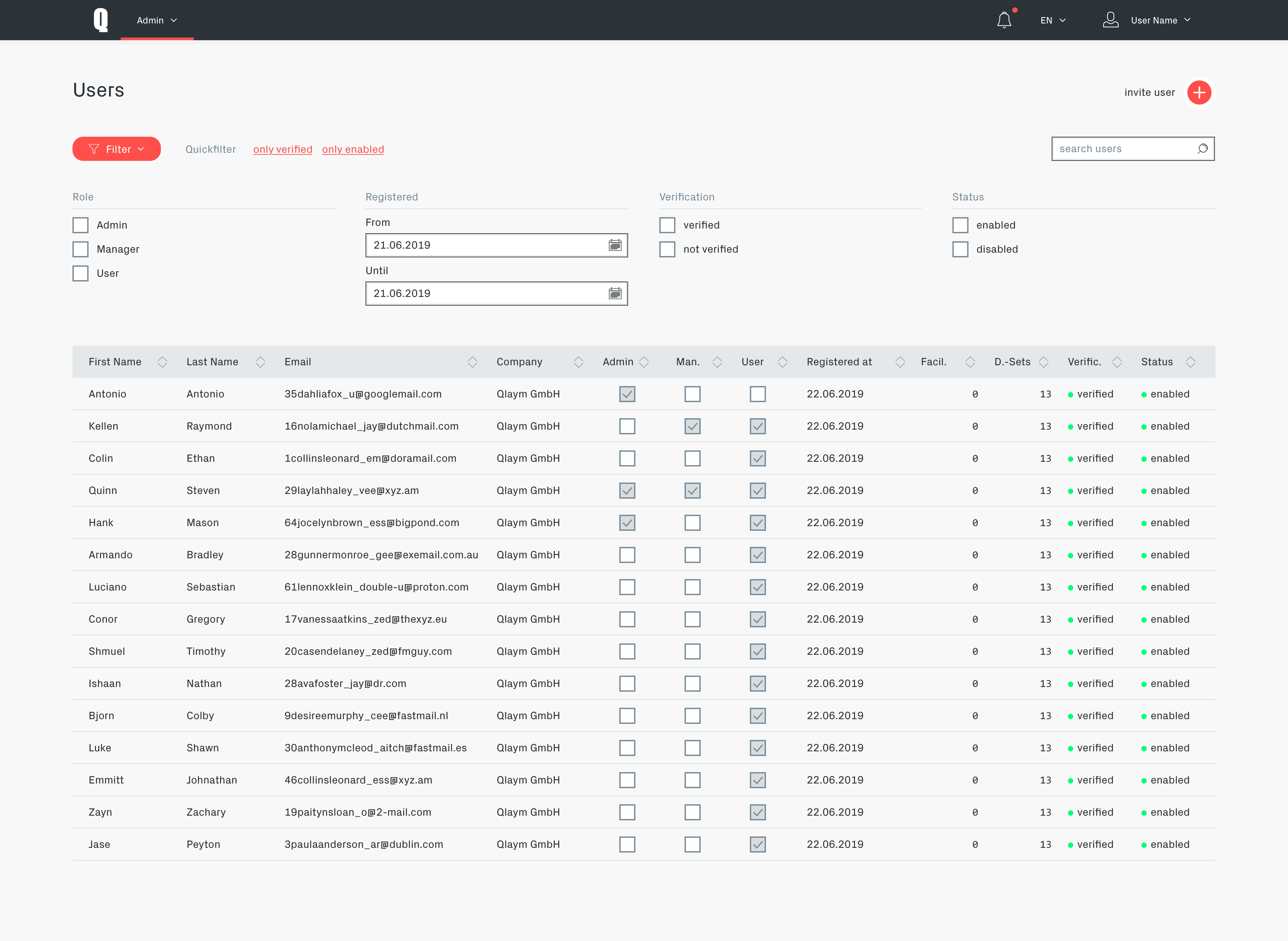
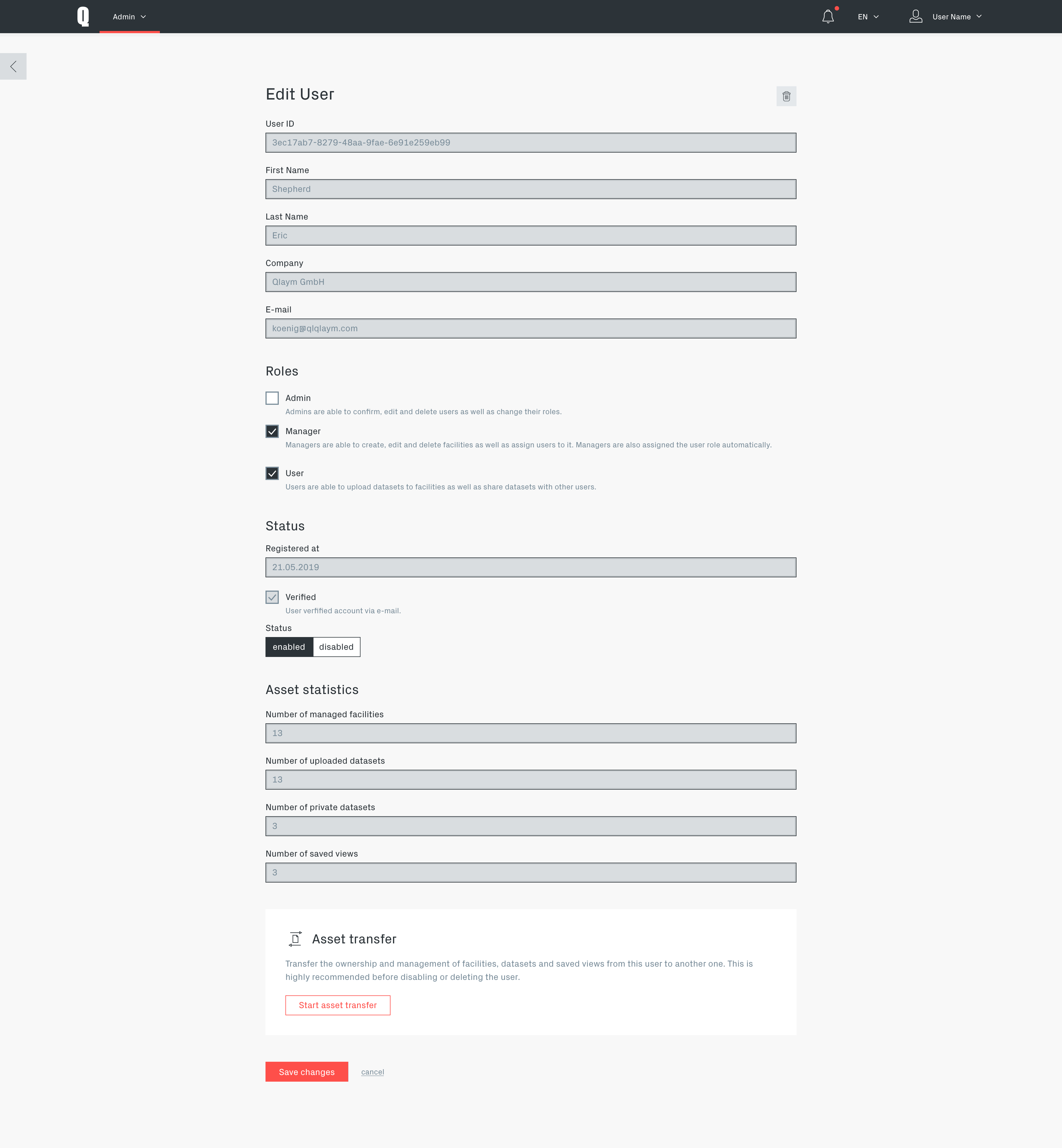
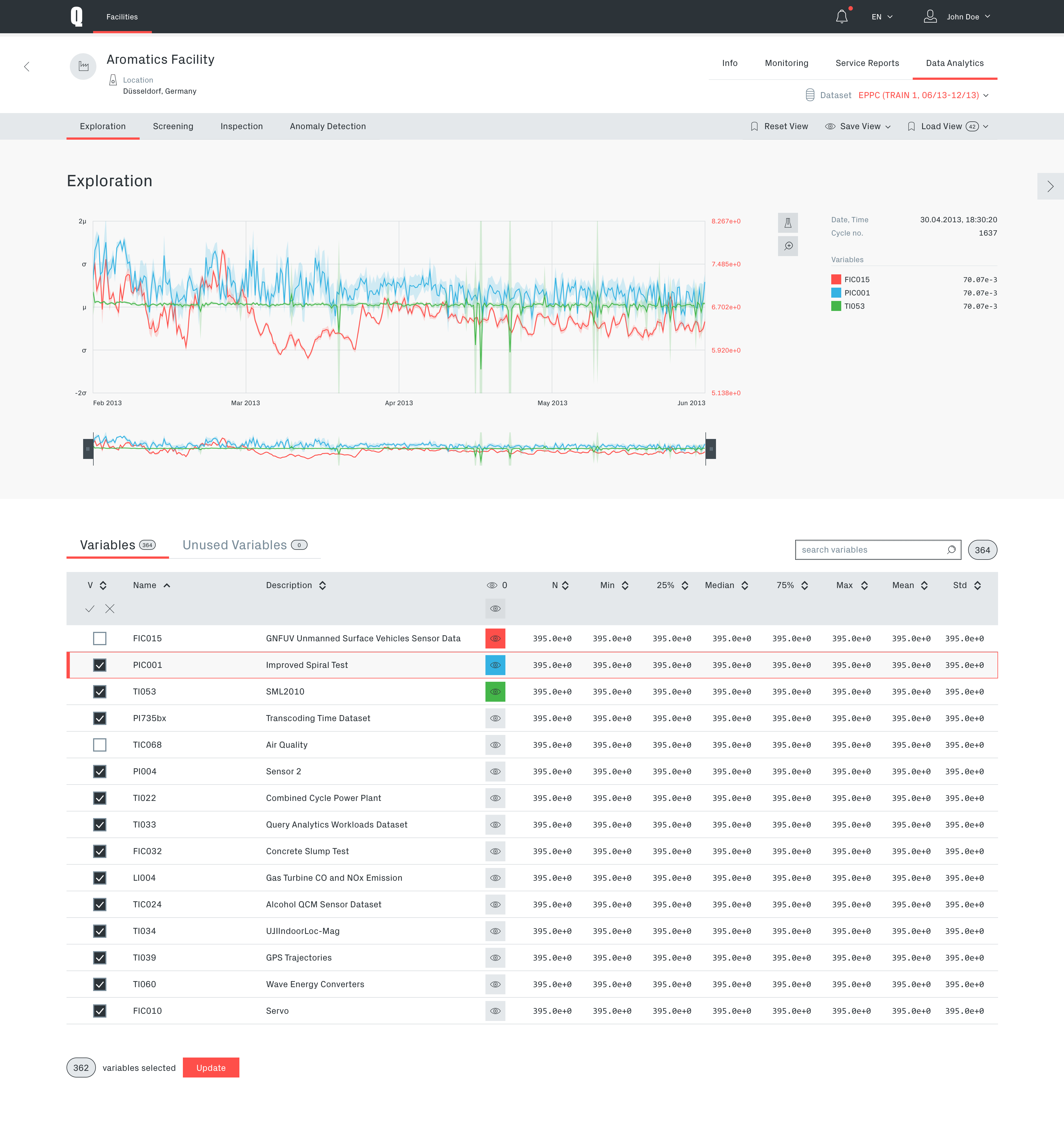
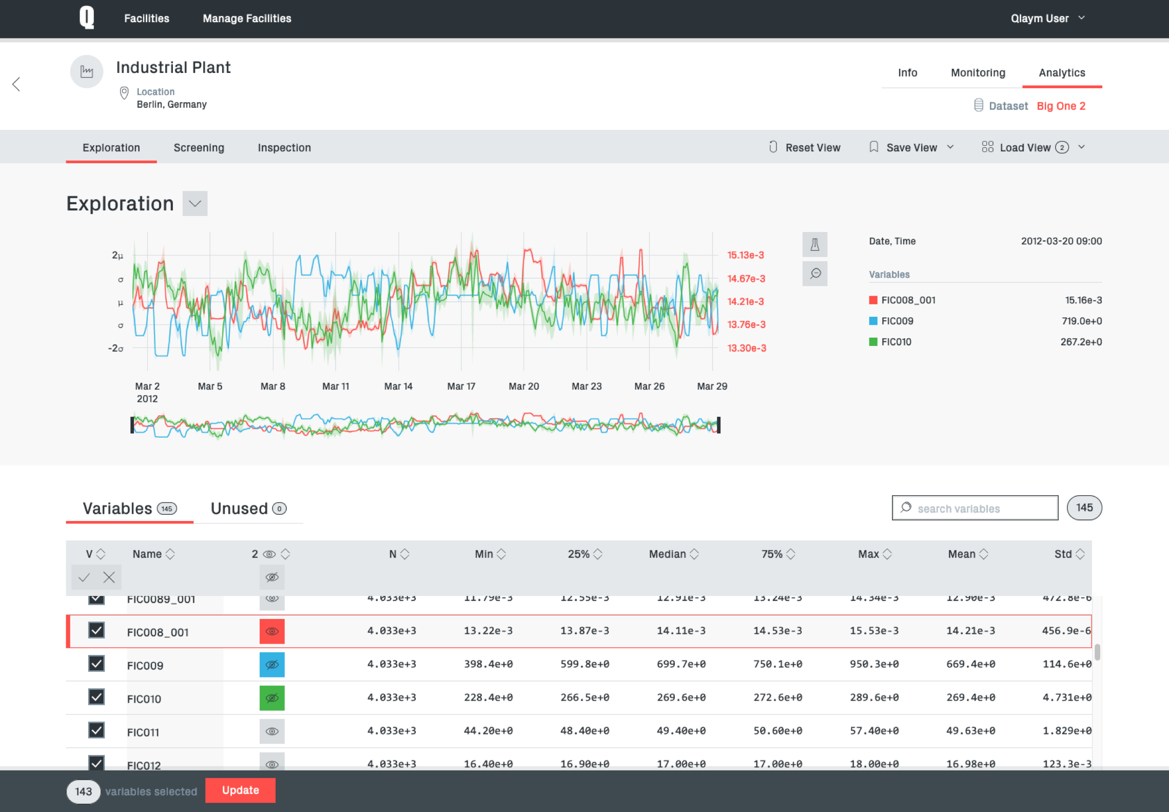
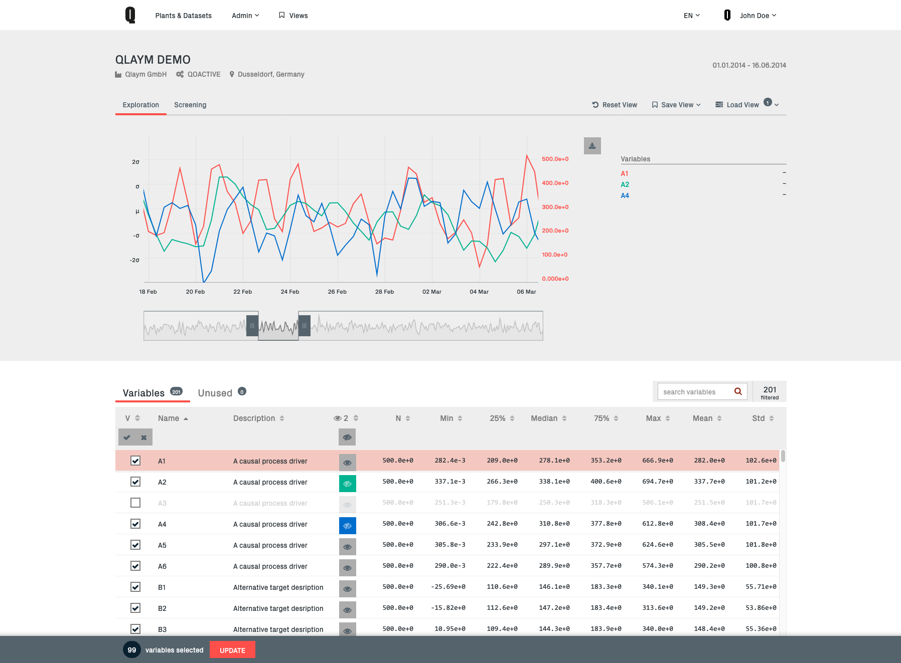
Data exploration module
The exploration module is providing the user with a overview of the data. It is also providing the functionality to narrow the data down to important information by removing unimportant parameters.
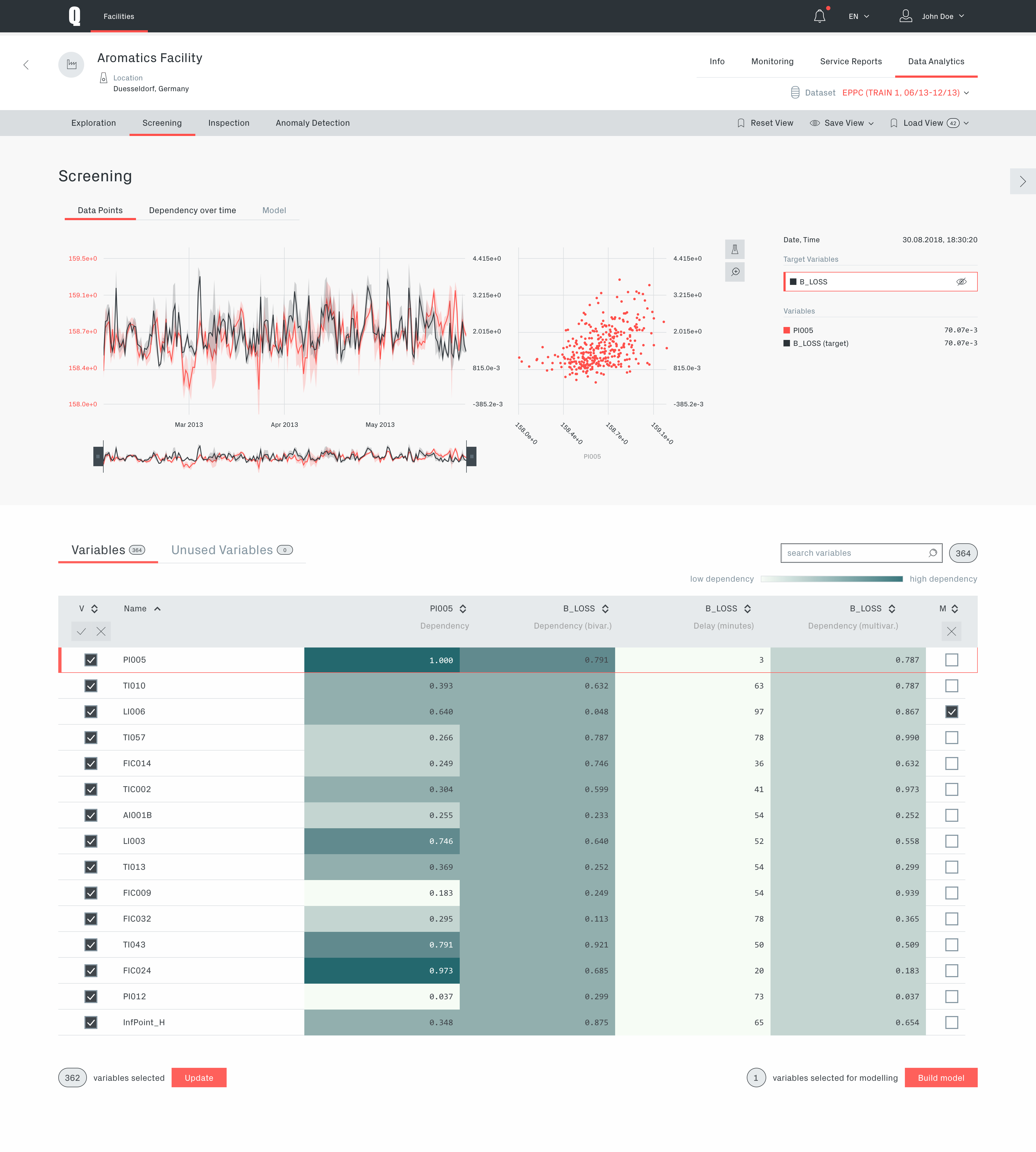
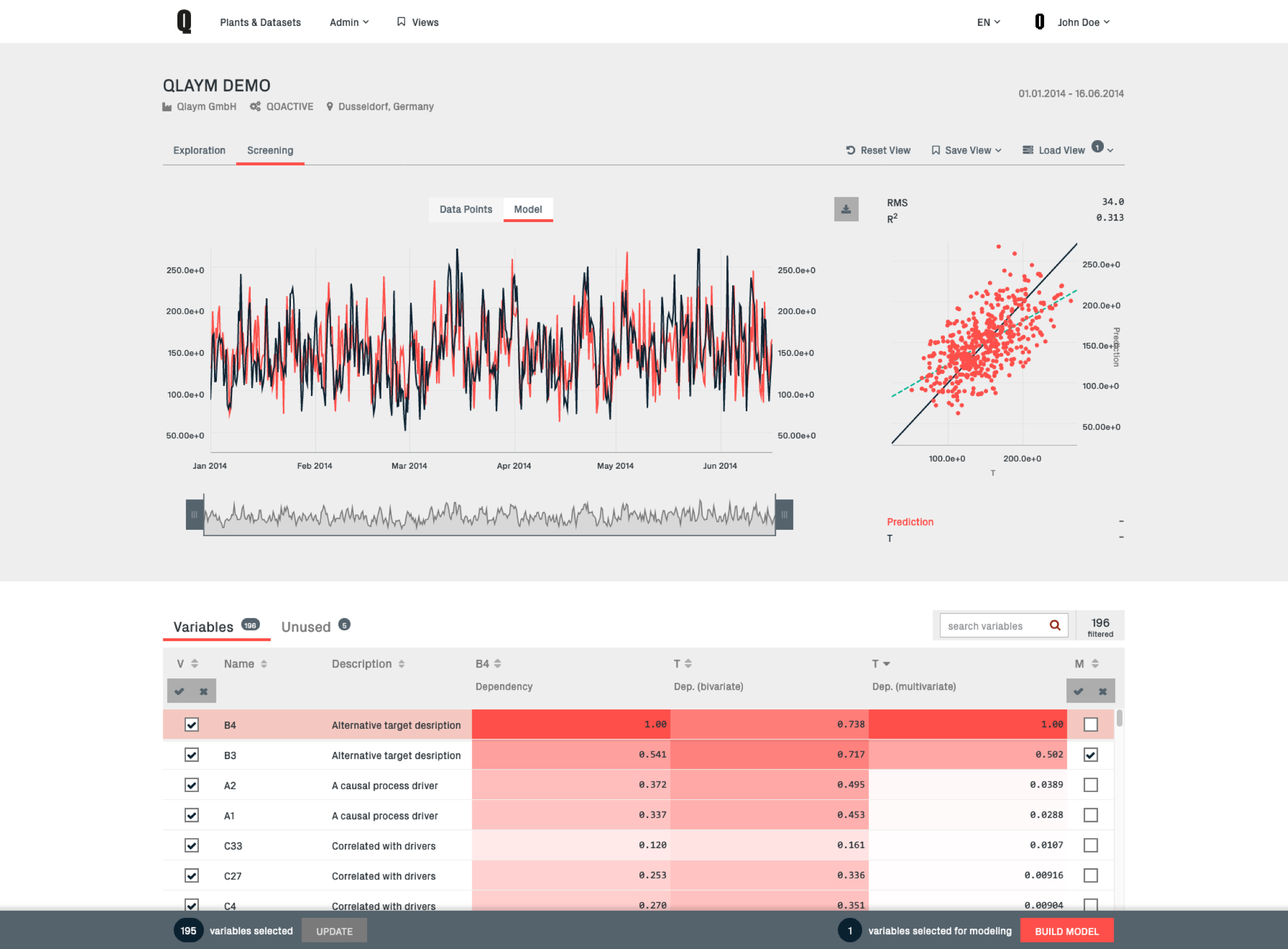
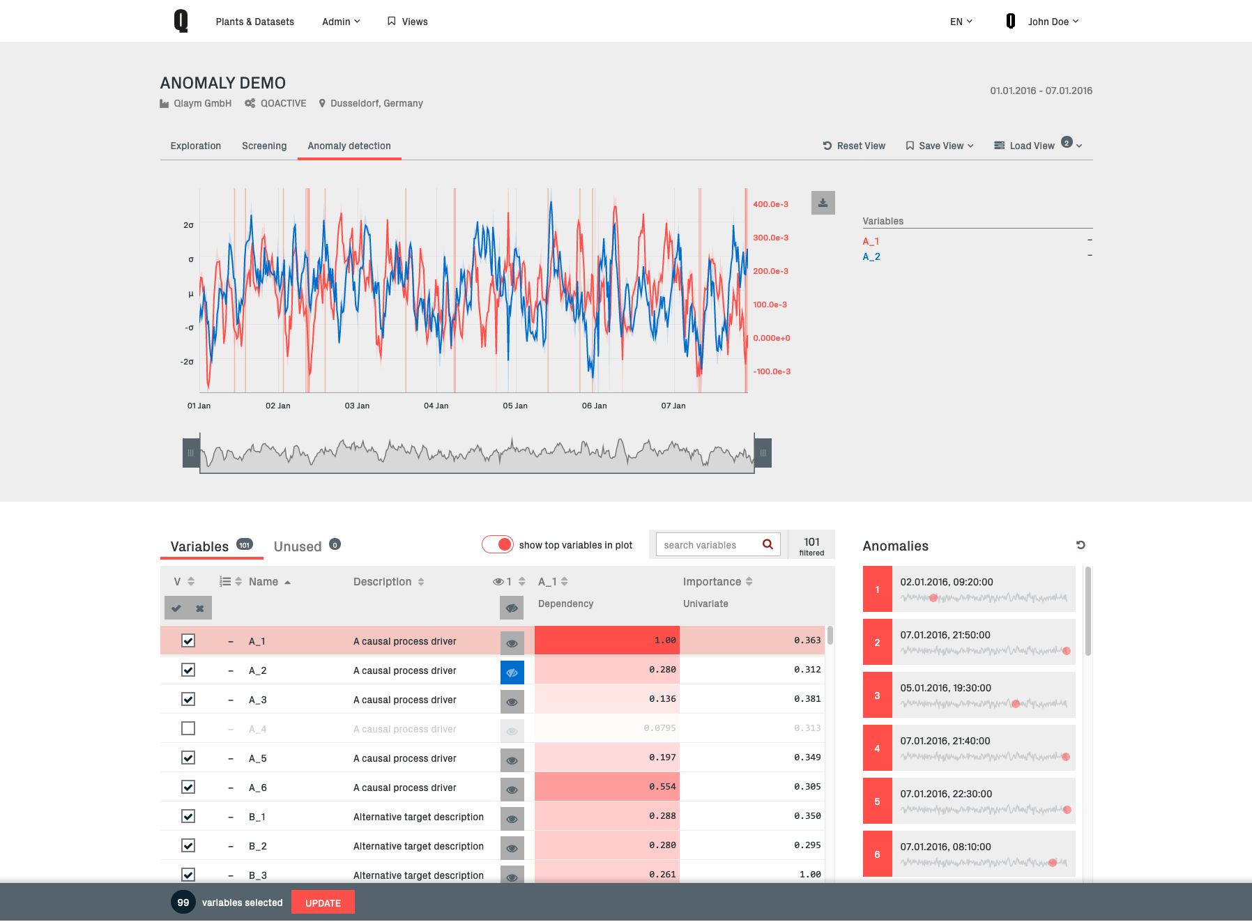
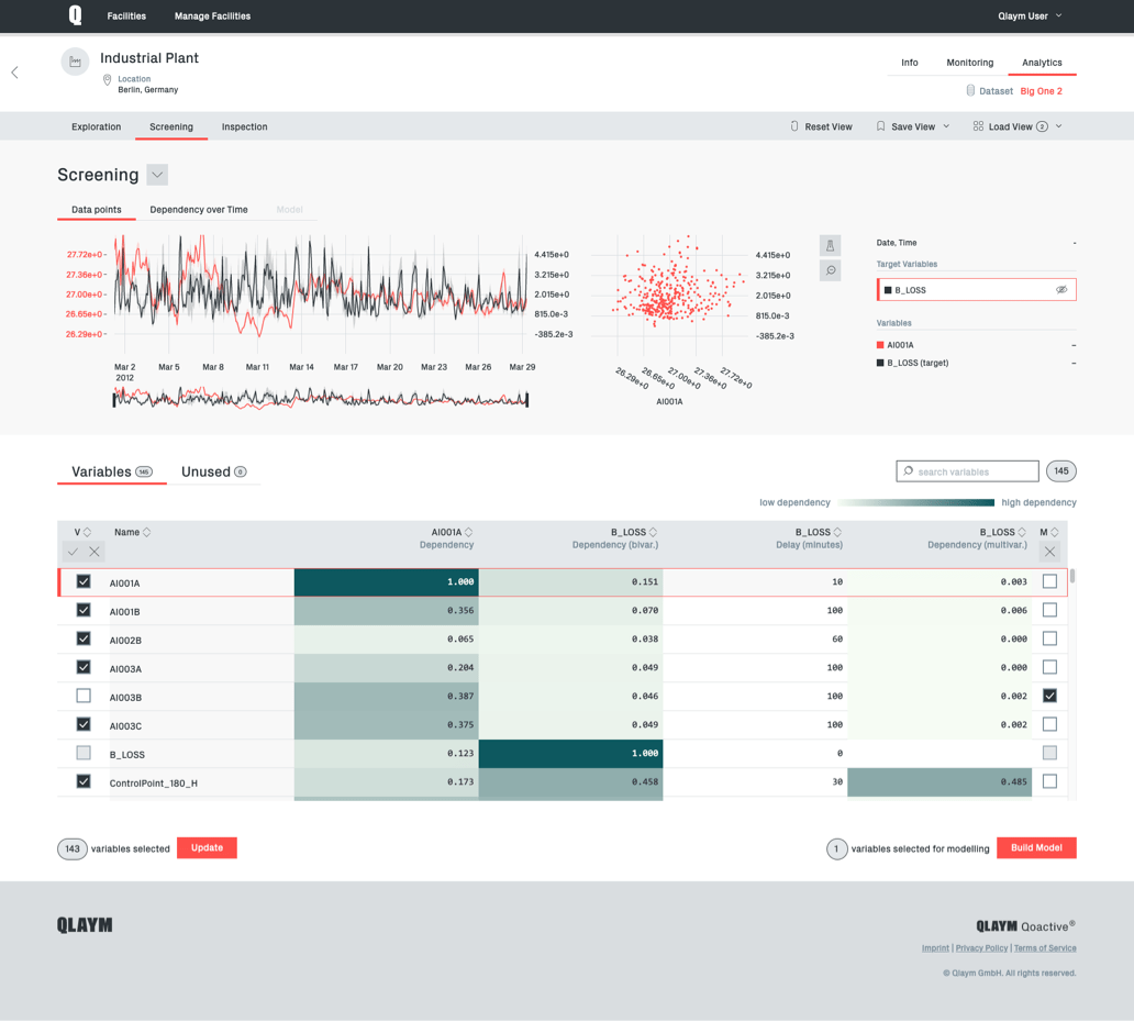
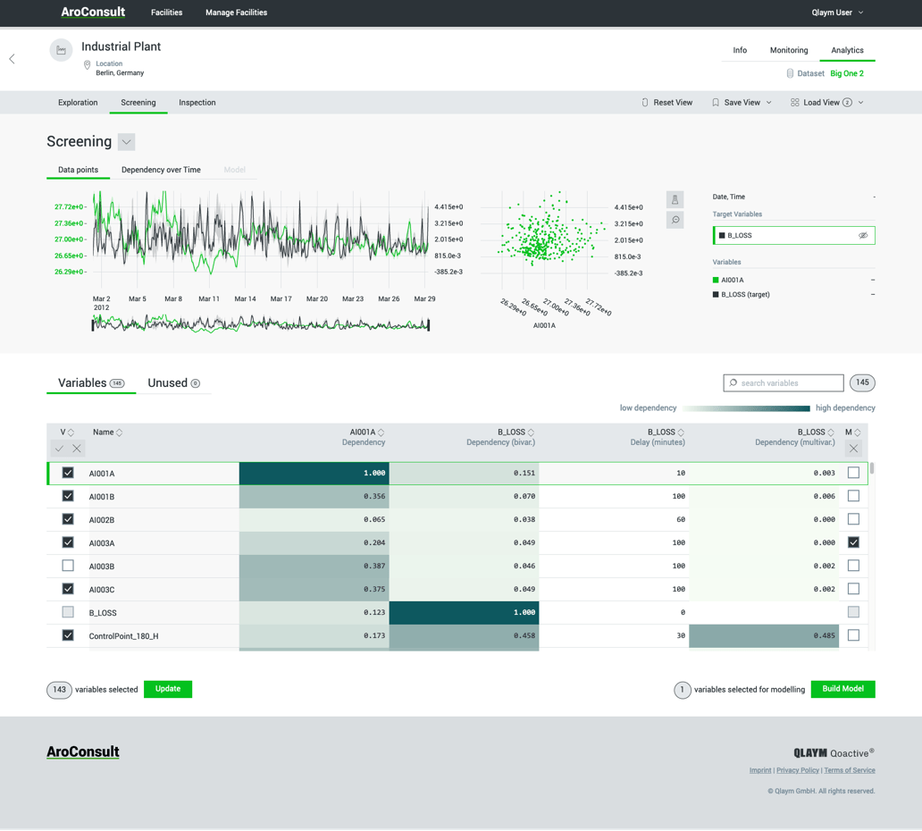
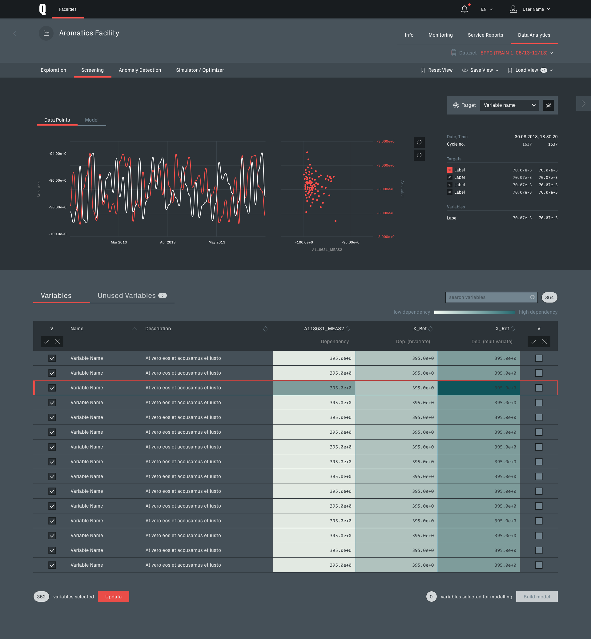
Data screening module
In Screening a target variable for the analysis is selected. The module is offering the ability to inspect which other variables are having a significant influence on the target.
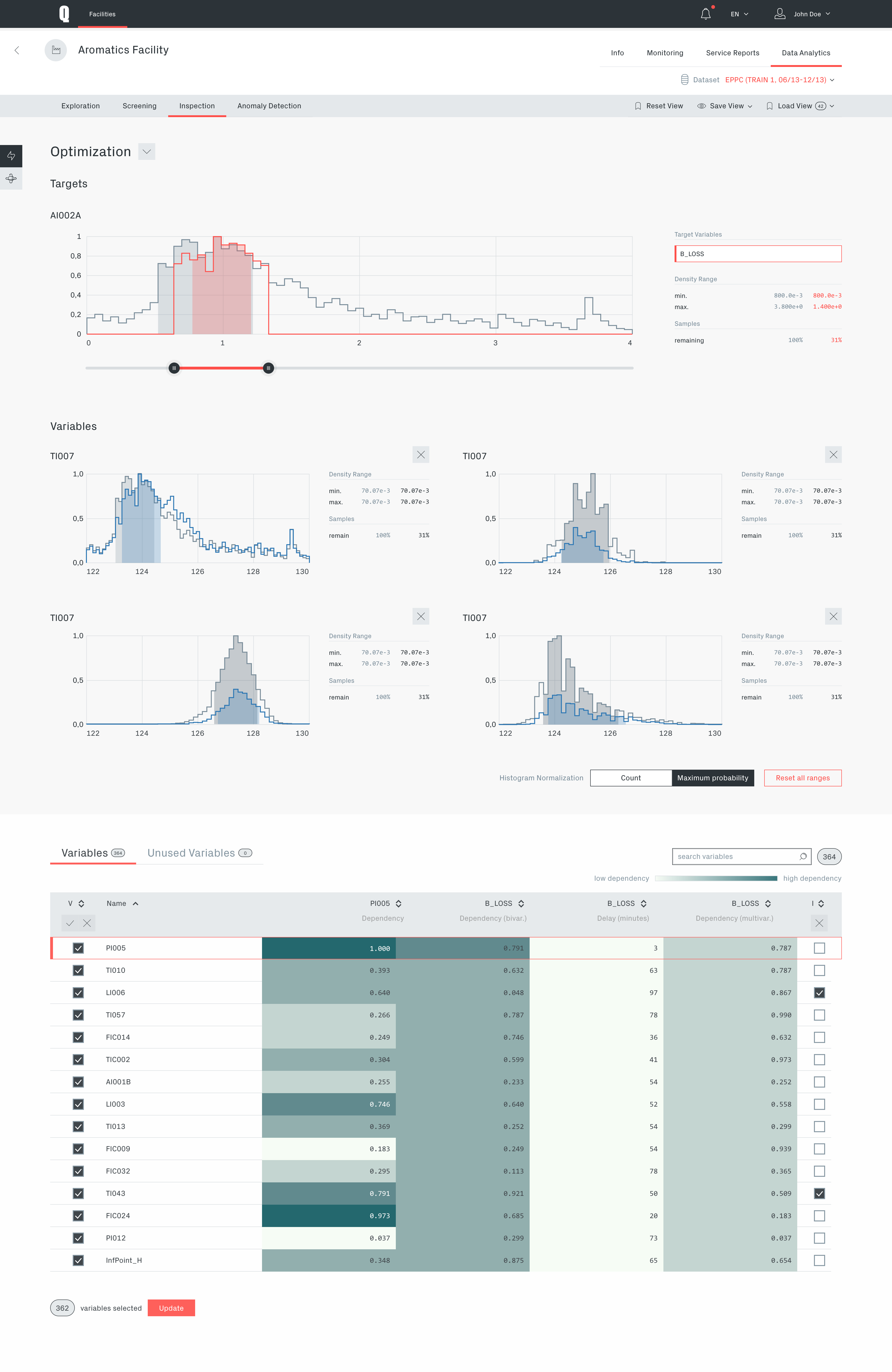
Inspection module in optimization view
This module is offering a way to optimize or simulate the setting of specific value ranges for variables in the dataset in order to improve the chosen target.
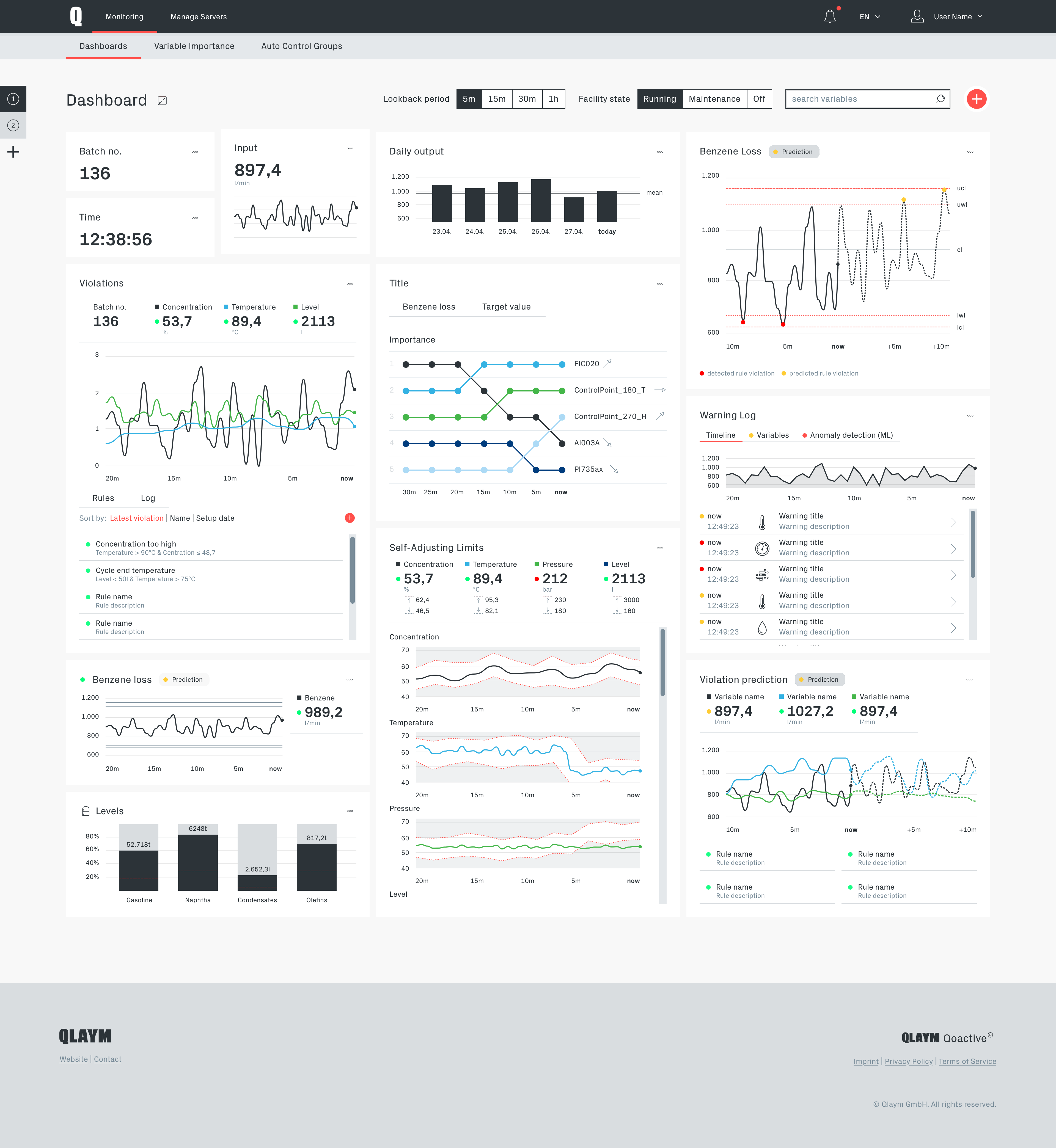
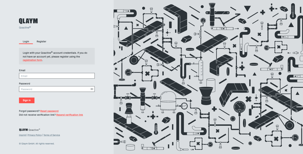
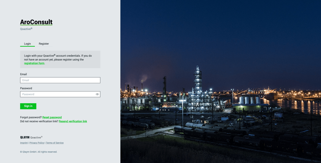
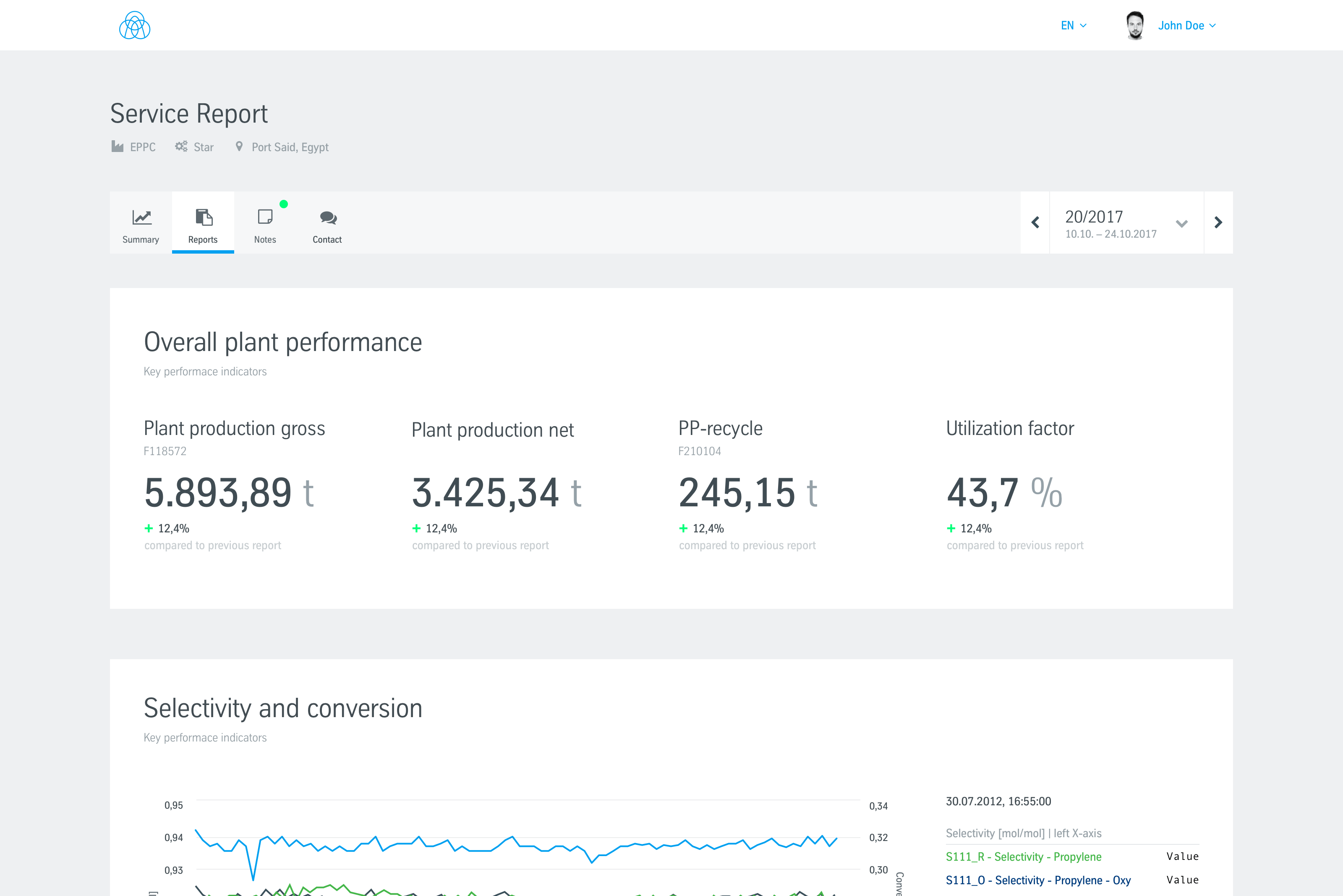
White Label
As a B2B "Software as a Service" product, Qoactive® was intended for large organizations.
It was designed and built with a white label option, so Qoactive®'s interface could adopt the customer's visual corporate identity.
This was done by creating branded design libraries technically implemented with a Webpack/SCSS setup which made adding and editing branded versions of Qoactive® convenient and fast.
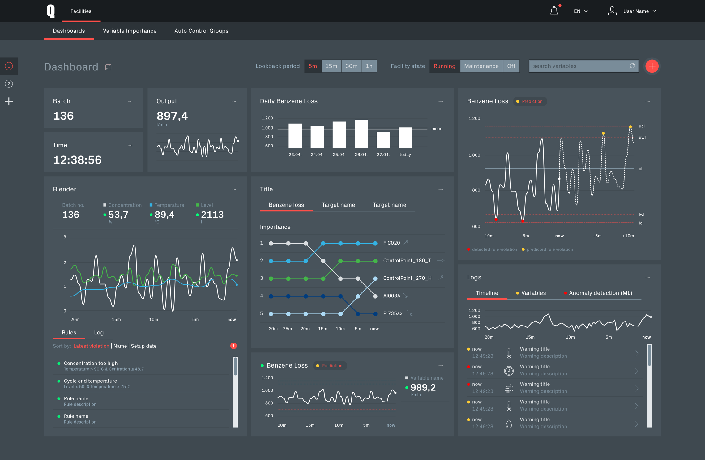
Darkmode
For real time analytics of production data Qoactive® would be used in a control room day and night and has to meet special requirements.
Particularly in the darker hours and in dim light the interface should be eye-friendly and prevent glaring while maintaining or even improving the visibility of important information. For this use case I designed a dark mode for the interface for the whole application.
Running on Qoactive® Subprojects
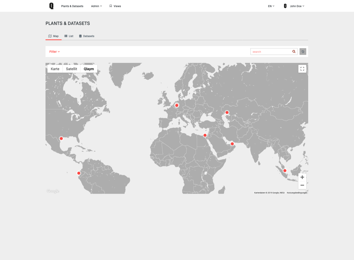
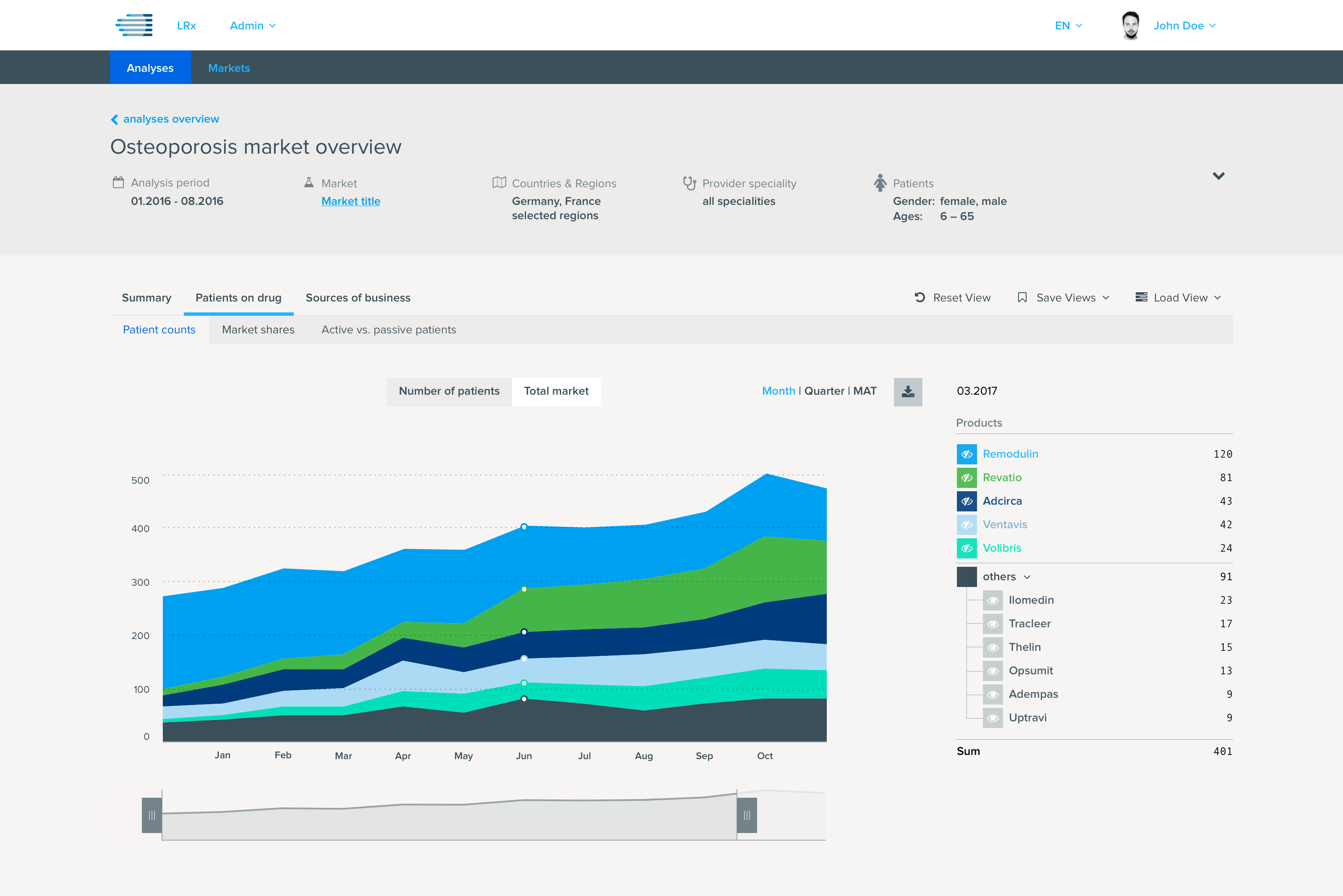
Qoactive® was meant as a flexible data analysis plattform for different data types and customers. It served as the base for several branded applications from the process and healthcare data field.
Standards and Components Design System
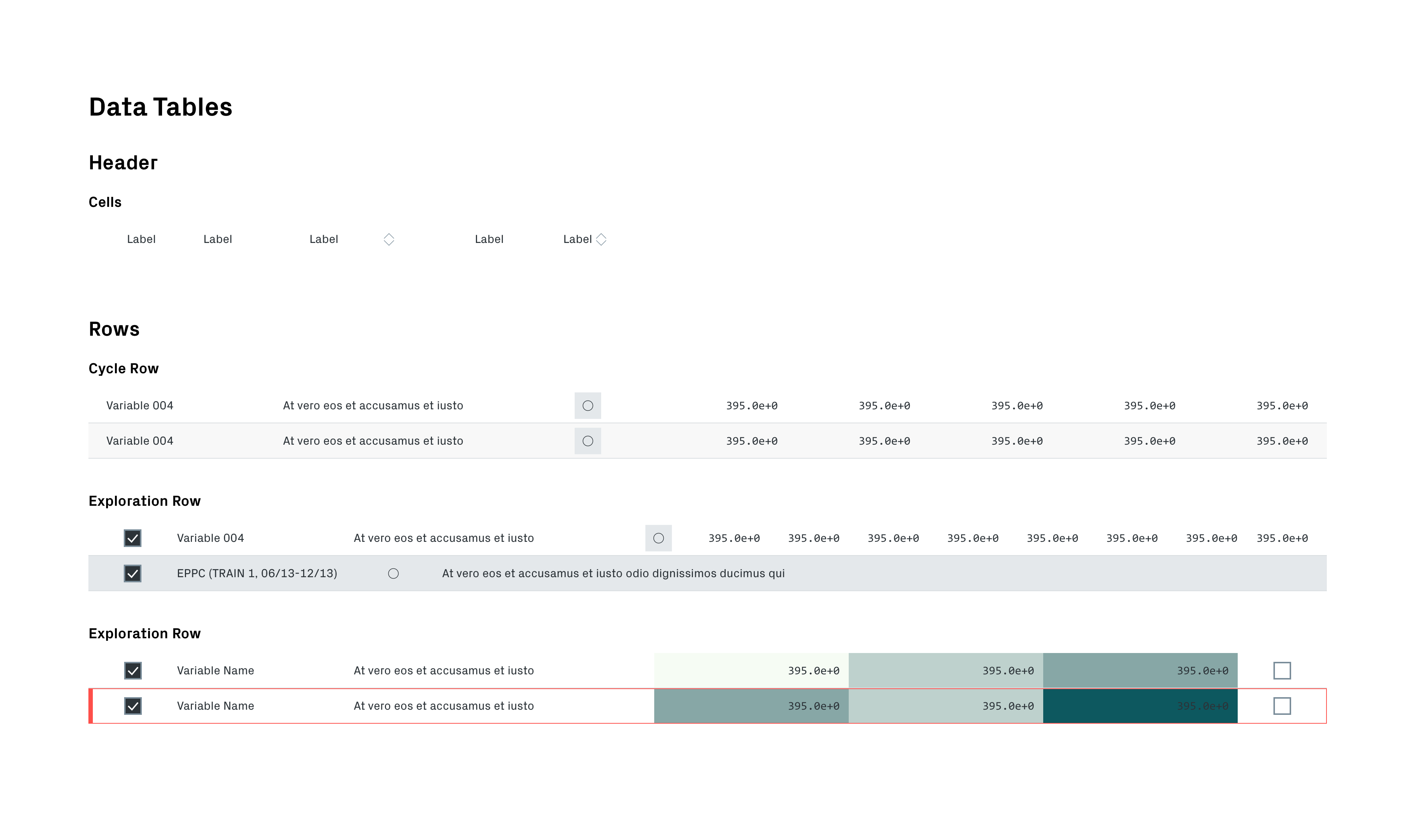
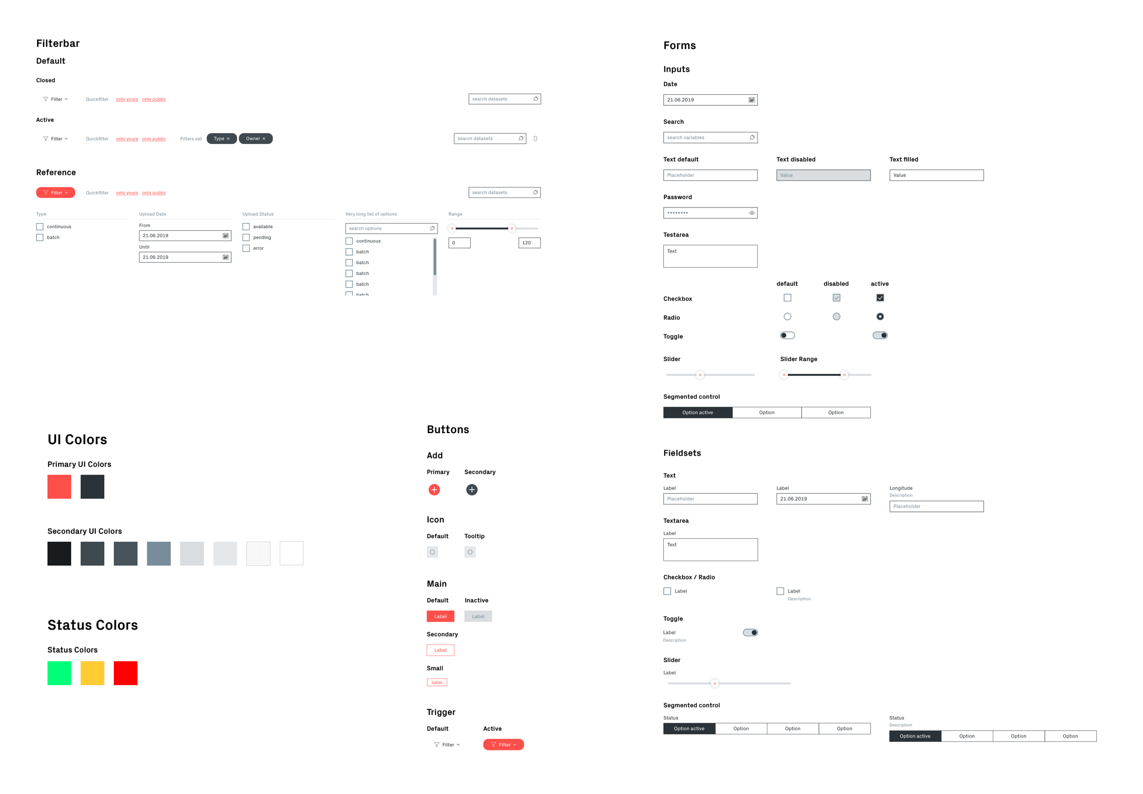
From the beginning, Qoactive® was designed with a design system in mind. This was enabling a progressive implemenation in design and development.
Standards were defined and documented collaboratively, design libraries were created and maintained and industry standard tools and methods in frontend component development used to keep the application consistent and maintainable.
Custom Icon Set
Icons are a fundamental component in applications, supporting users in navigating and recognizing specific functionalities.
From a handful of icons included in Qlaym’s updated visual corporate identity I extracted and refined the underlying ruleset to design an icon set with the required (SVG) icons for Qoactive®. Of course, these became part of the design system.

Technical Building Blocks
Design Versioning

In order to have a single source of truth in design, keep track of the design history and improve collaboration, we wanted to implement version control in our workflow.
After researching the options, we went with Kactus because it allowed us to use our inhouse Git servers and we kept total control of our data.
React Components

The React core of the application is resembling the symbol based design: it is completely component based with React Styleguidist for documentation.
We later switched to Storybook to also have a component workshop and to be able create components in isolation.
CSS Framework
To gain technologic freedom and allow third party development for Qoactive® we started creating a JS-framework agnostic standalone CSS framework based on SCSS and using ITCSS and BEM methodologies.
It incorporates KSS(-Node) for the documentation of the whole CSS and its principles.
A difficult task User Research and Testing
The Challenge
The biggest challenge in this project was the difficulty to do user research and run user tests.
- The active user base was very small and those users were hard to approach
- Usage of Qoactive's core functionalities required a specific type of data (industrial process data) and most importantly a specific knowledge about this dataset and goals of the analysis
This made it barely impossible to acquire a solid user base for constant research and testing which was very unsatisfying, since I strongly believe in a user centered design process and the importance of user testing.
The Solution
We reached good results with dogfooding: using Qoactive® constantly for data analysis in project work and doing internal testing.
We also held on to proven standards in data analysis and visualization. When user testing was possible, we tried to gain the most value from it, which led to some important insights and improvements.
Testing was conducted as moderated in-person usability test and was video recorded for evaluation. Qoactive® proved to be solid usability-wise and got positive feedback. But as always, the test made some issues visible which and the application was improved accordingly in the aftermath.
Takeaways Learnings & Conclusion
Qoactive® was a very challenging but rewarding project for many reasons. From the UX/UI point of view it was in a bare bones state when I joined, which made it possible to work on it from start to finish, taking a broad set of roles and tasks.
I enjoyed getting familiar with the topic of machine learning and big data analysis and its possibilities and functionalities. Data analysis is a complex field to design for, because it takes a lot of effort to create straightforward processes that lead to useful insights.
Results
Qoactive® Version 2 got very positive reactions when it was first presented at Hannover Messe 2019 and performed well in tests with its users.
Its design was a figurehead of Qlaym and helped arouse interest in the startup’s services. The application’s modular setuo and design system were a solid base for the further growth of Qlaym.
Unfortunately with Qlaym shutting down in mid 2020, Qoactive® is sentenced to a life in backups.