Time
- 2016
Role
- UX Design
- UI Design
- Frontend Development
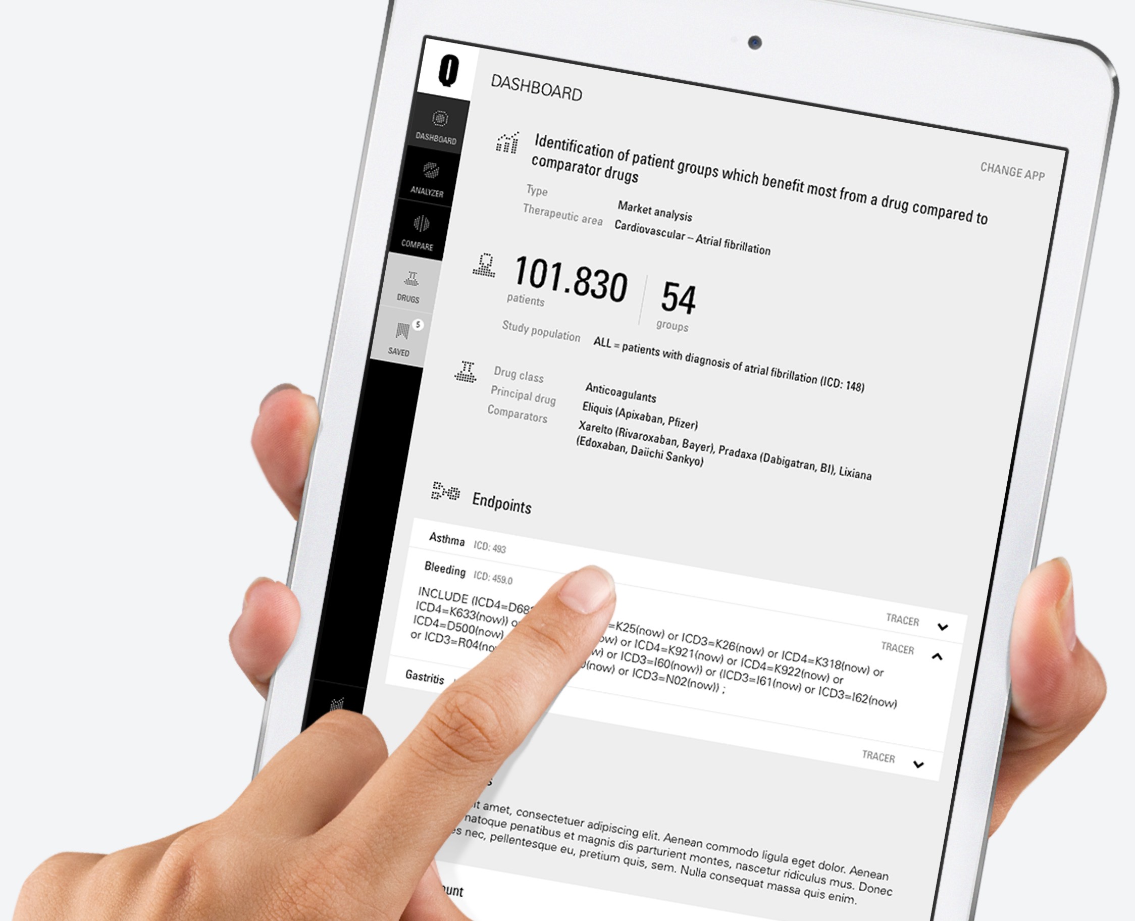
In 2017, while being a freelancer, I was approached by the Qlaym Healthcare AG to support them with the UX/UI design of a web application named Qoactive® Health.
Qoactive® Health was build as a white-label SAAS app for a client. It used machine learning on drug prescription data in order to gain detailed insight into the relations between disease diagnoses, patient types and drug prescriptions over time.
This case study may contain sensitive information. You are kindly asked for discretion.
Design in cooperation Process
UX/UI Design
Qoactive® Health had to be designed and built within a tight timeframe. The first Version needed to be ready within around three month.
I was working closely with a data scientist from the team, who introduced me to the focus and requirements of the application.
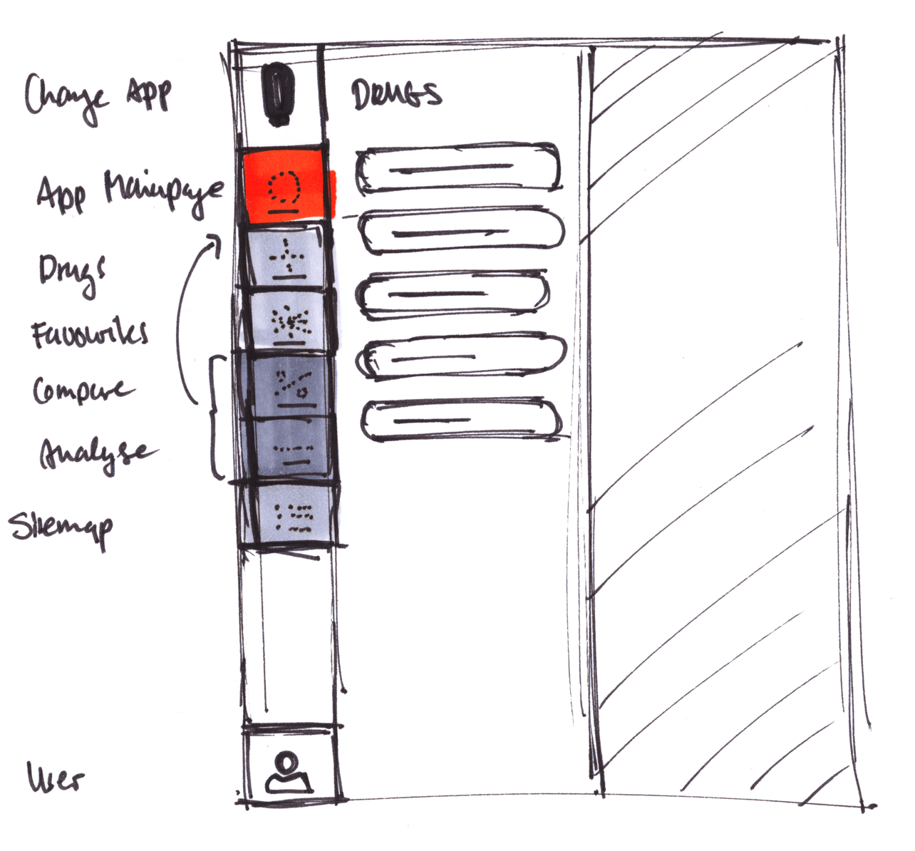
In several workshops we created a concept and sketched the design wich were later presented internally. We discussed the feedback and improved workflows and design accordingly.
Development
After the design phase I was subsequently also commissioned to support the app's template development in React by building the necessary templates.
Design
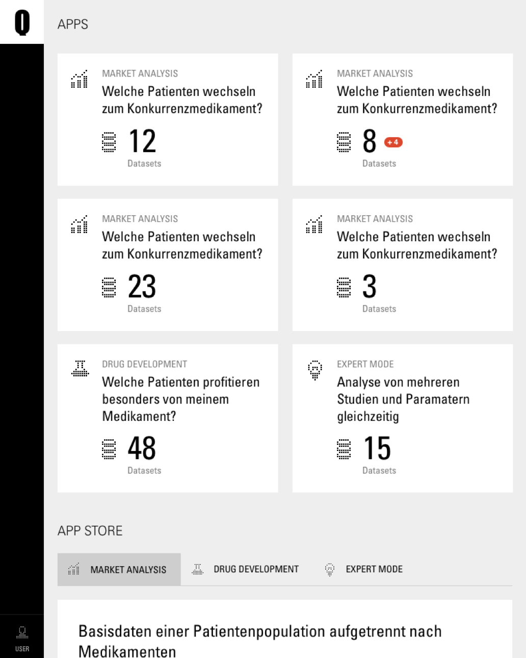
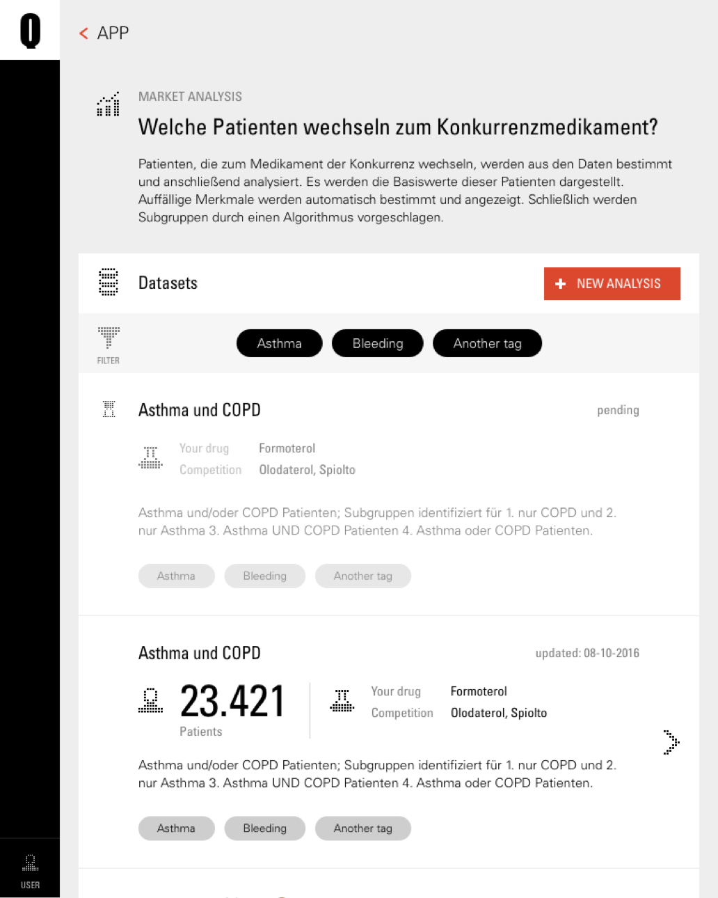
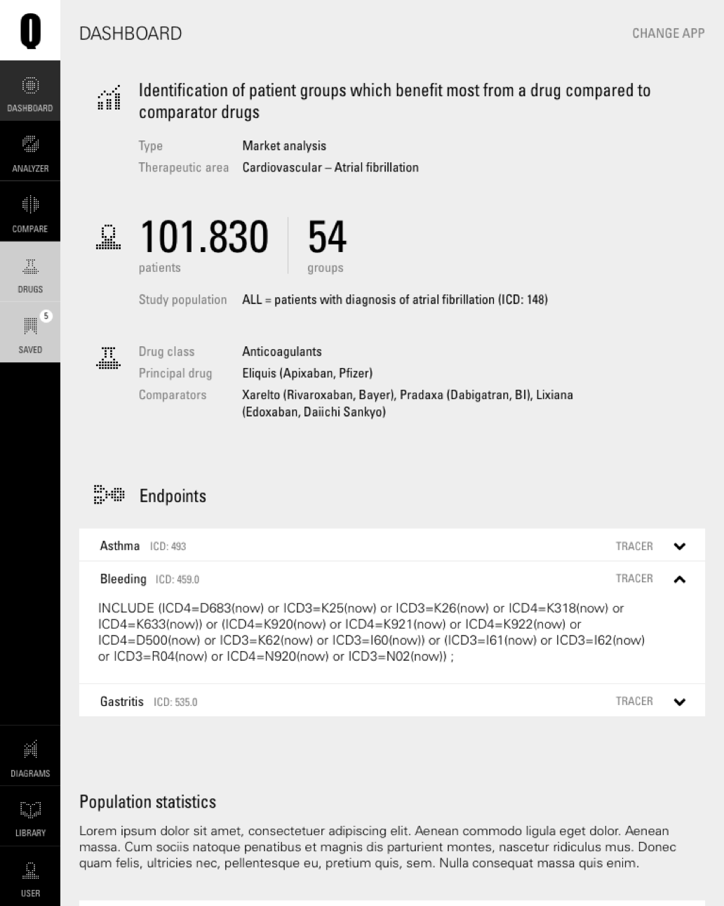
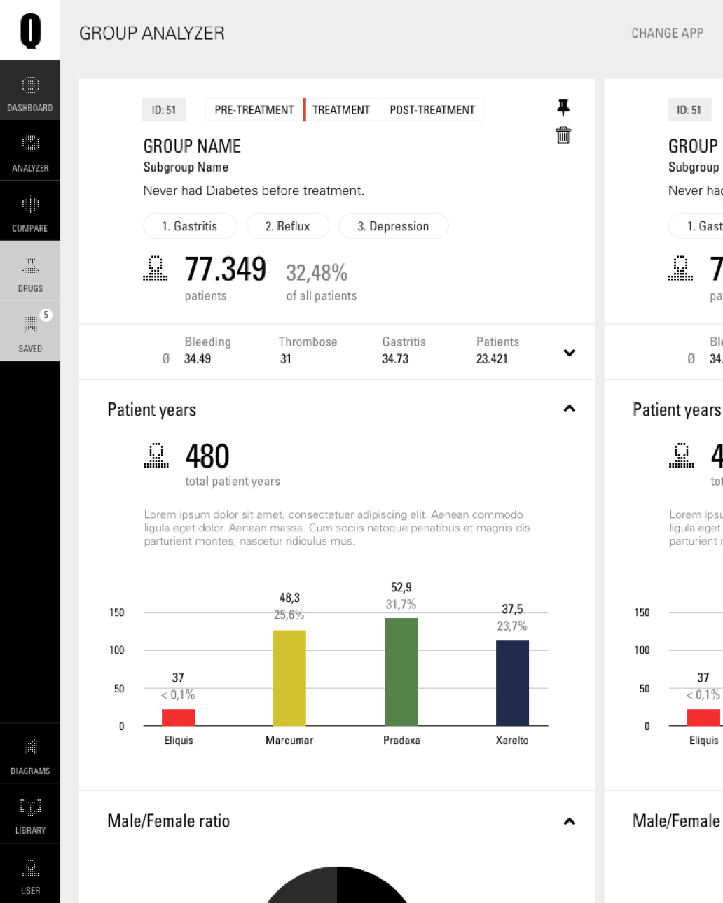
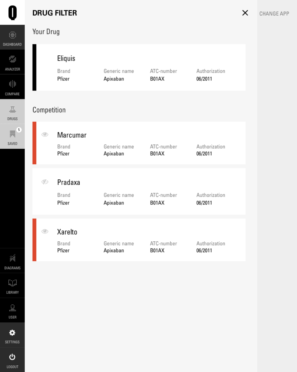
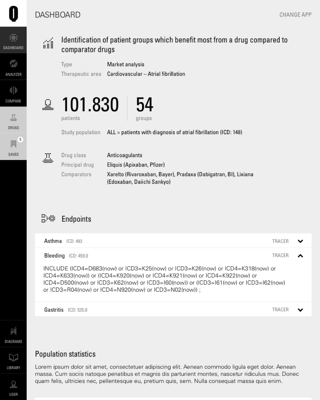
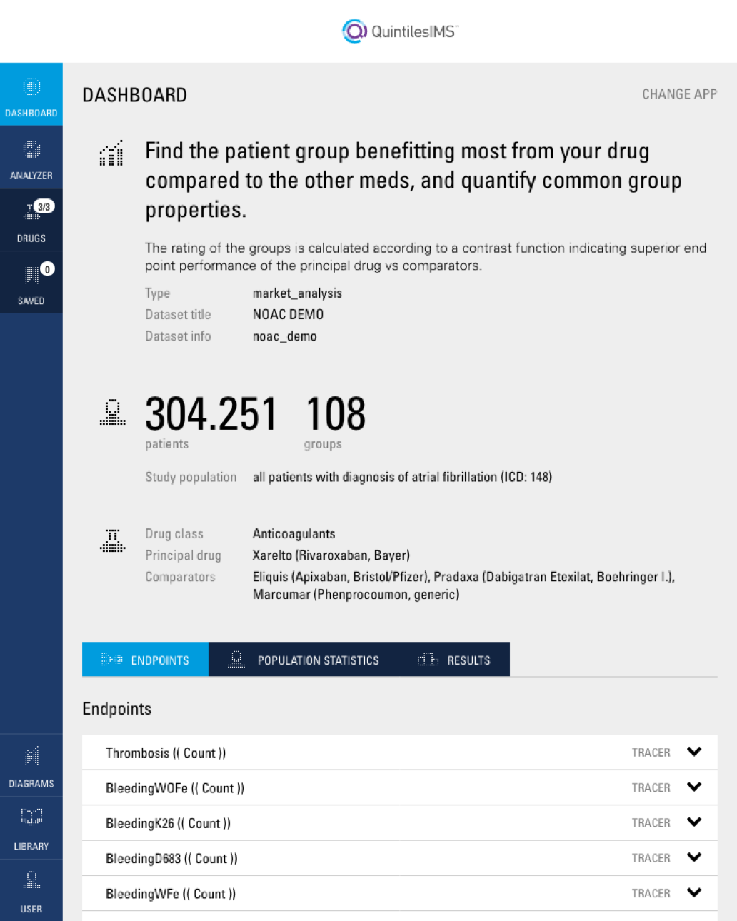
The app was focussed on tablet use, so the design started from screen sizes resembling a tablet in portstrait mode. Additional view in landscape mode and a desktop version were designed additionally.
Branding
White-Label
Qoactive® Health was a white label SaaS application, which was considered in the UI design and web development.
Icons
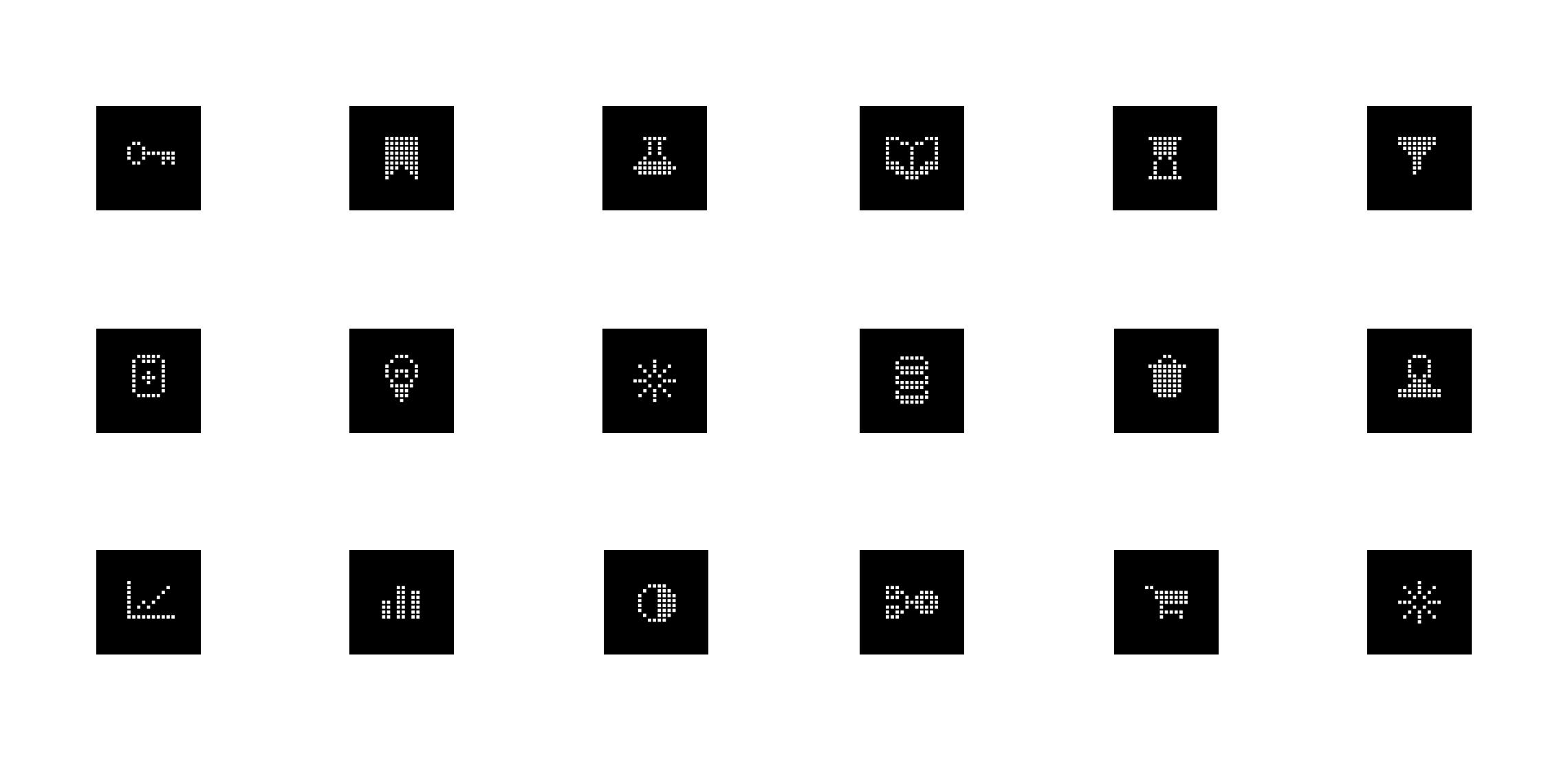
Based on Qlaym's branding at the time, which was relying a grid of squares for decorative elements, I developed an icon set for Qoactive®.
Takeaways Learnings & Conclusion
This project was my jump-start introduction into healthcare data, machine learning and web development in React. I learned a lot in a short time and enjoyed the close collaboration with the company's data scientists which led to results fast.
Even though the application unfortunately did not lead to a lasting business, the project paved the way for me to join the sister company GmbH as their fulltime UX/UI designer to work on similiar applications and projects.